Boutique fermée temporairement.

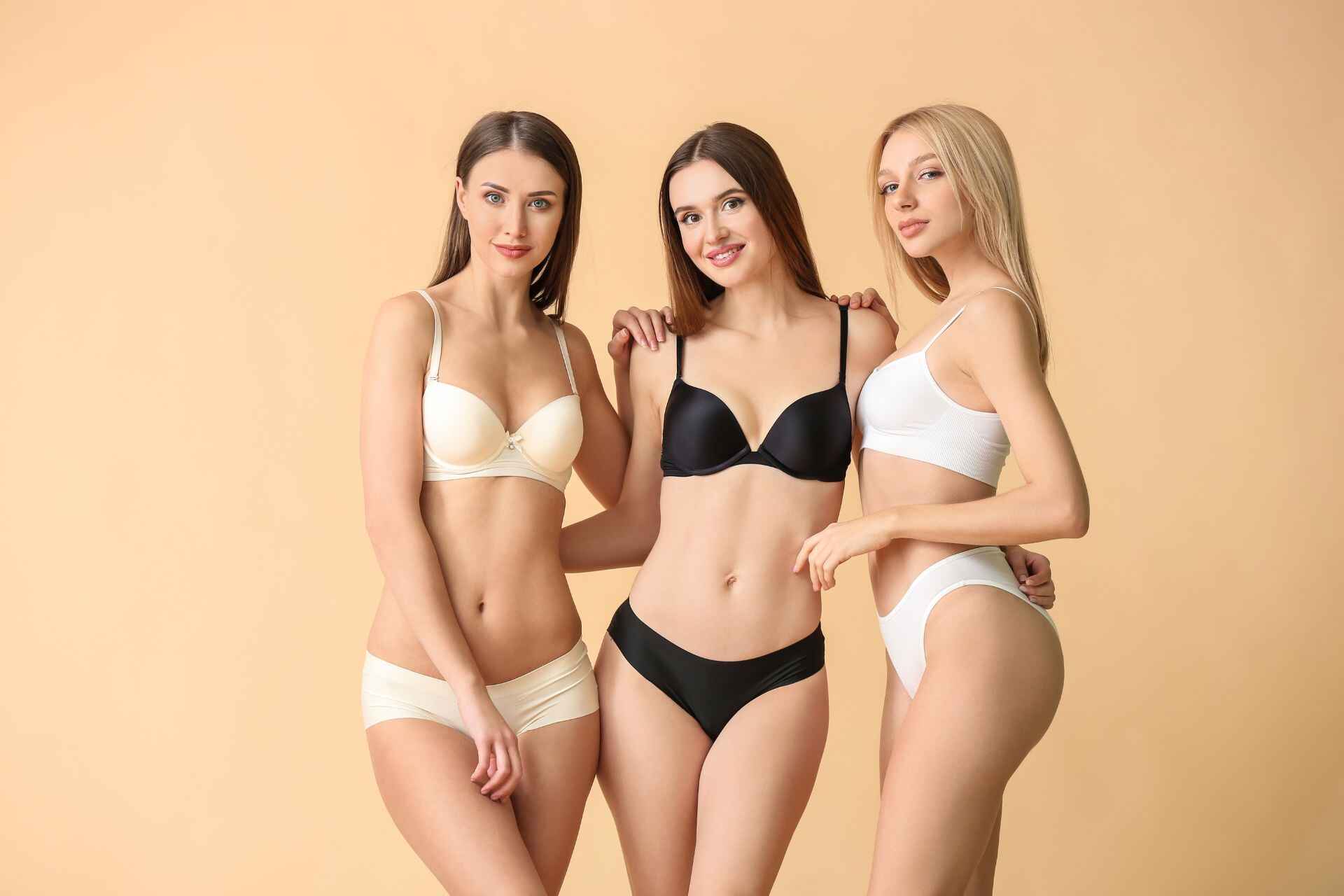
Quel est le sous-vêtement préféré des femmes ?
Le sous-vêtement préféré des femmes
Le choix du sous-vêtement préféré des femmes n’est pas seulement une question de goût : il influence le bien-être, la confiance et même le style personnel. En effet, le sous-vêtement joue un rôle essentiel dans la garde-robe féminine, combinant confort, esthétique, et expression de la personnalité. Que ce soit pour le quotidien ou pour des occasions spéciales, les sous-vêtements accompagnent chaque femme en s’adaptant à ses besoins, sa morphologie, et son style.
Le monde de la lingerie est vaste, proposant des pièces variées allant du soutien-gorge structuré au tanga léger, en passant par la culotte taille haute et la bralette sans armatures. Ce choix de sous-vêtement préféré des femmes reflète des tendances évolutives, influencées par des besoins de confort, de praticité et de style. Certaines optent pour des modèles en coton doux pour un confort absolu, tandis que d’autres privilégient des matières comme la dentelle ou le satin pour un effet plus élégant et séduisant.
En somme, la lingerie féminine est bien plus qu’un simple sous-vêtement : elle devient un symbole d’expression personnelle et de confiance en soi. Cet article explore les types de sous-vêtements préférés des femmes, les critères de choix essentiels, les matériaux et les tendances qui permettent à chaque femme de trouver le parfait équilibre entre confort et élégance.
L’importance du sous-vêtement dans le quotidien des femmes
Les sous-vêtements occupent une place essentielle dans la vie quotidienne des femmes. Au-delà de leur rôle fonctionnel, ils sont un vecteur de confort, de bien-être et d’expression de soi. En effet, choisir un sous-vêtement préféré des femmes implique bien plus qu’une simple décision vestimentaire ; cela revient à choisir une seconde peau qui soutient et accompagne chaque mouvement au fil de la journée. Le bon sous-vêtement offre non seulement une sensation de confort, mais aussi de sécurité, permettant de se concentrer sur ses activités sans inconfort. L’effet psychologique de porter des sous-vêtements qui plaisent et qui s’adaptent parfaitement est un véritable boost pour la confiance en soi.
Outre l’aspect confort, les sous-vêtements sont un moyen d’expression, de raffinement, et de soin de soi. En choisissant une lingerie dans laquelle on se sent bien, on affirme une attention portée à soi-même, qui impacte positivement l’attitude générale. Ce choix contribue au sentiment de bien-être, et permet aux femmes de se sentir élégantes et affirmées, qu’elles soient habillées pour une journée de travail, une sortie spéciale ou un moment de détente.
Rôle dans le confort et la confiance en soi
Le confort est un aspect fondamental dans le choix des sous-vêtements. Un sous-vêtement bien ajusté, adapté à la morphologie, permet d’éviter les inconforts comme les irritations ou les marques visibles sous les vêtements. Cette sensation de confort physique contribue à renforcer la confiance en soi. Quand une femme porte un sous-vêtement dans lequel elle se sent à l’aise et soutenue, elle adopte naturellement une posture plus ouverte et plus assurée. Cette influence se manifeste également sur le plan émotionnel : un bon sous-vêtement aide à se sentir en harmonie avec soi-même, à être plus détendue et prête à affronter la journée.
Le choix du sous-vêtement permet également d’accompagner les humeurs et les personnalités. Certaines préfèrent des modèles discrets, d’autres optent pour des styles plus audacieux. Quel que soit le choix, l’important est de trouver des pièces qui reflètent sa propre image et qui répondent aux besoins personnels. En sélectionnant des modèles en accord avec leur style et leurs besoins, les femmes construisent une image d’elles-mêmes plus positive et plus confiante.
Le confort d’un sous-vêtement dépend largement des matières utilisées, comme l’explique l‘Institut Français du Textile et de l’Habillement, qui étudie en profondeur les caractéristiques des fibres textiles pour la lingerie
Impact sur la posture et l’assurance personnelle
Les sous-vêtements jouent aussi un rôle dans la posture. Un soutien-gorge bien ajusté, par exemple, aide à maintenir la poitrine de manière équilibrée, ce qui a un effet direct sur la posture. En offrant un bon maintien, le soutien-gorge favorise une position plus droite des épaules et aide à éviter les douleurs dorsales. Cette posture améliorée permet de dégager une image plus assurée et confiante. De plus, se tenir droite et alignée améliore la démarche et renforce encore la confiance en soi.
Au-delà de l’apparence physique, la sensation de maintien et de soutien joue un rôle sur l’état d’esprit. Les femmes qui portent des sous-vêtements adaptés à leur morphologie et à leurs besoins se sentent plus légères et plus à l’aise. Un bon soutien affecte positivement l’humeur, permettant de mieux se concentrer et de se sentir alignée dans ses actions quotidiennes.
Types de sous-vêtements et leurs atouts spécifiques
Les sous-vêtements préférés des femmes se déclinent en une large variété de modèles, chacun ayant des caractéristiques et des avantages spécifiques. Voici une sélection des types les plus populaires et leurs atouts principaux :
| Type de sous-vêtement | Atouts principaux |
|---|---|
| Soutien-gorge corbeille | Élégance et mise en valeur du décolleté avec un maintien adapté |
| Bralette | Confort optimal sans armatures, parfait pour un usage quotidien |
| Culotte taille haute | Maintien de la silhouette et effet sculptant |
| String | Discrétion sous les vêtements ajustés, idéal pour éviter les marques |
| Tanga | Compromis entre confort et discrétion, parfait pour une allure naturelle |
| Body | Maintien complet et style élégant, idéal sous des tenues moulantes |
Chaque type de sous-vêtement répond à des besoins différents. Le soutien-gorge corbeille, par exemple, est idéal pour les tenues mettant en valeur le décolleté, tandis que la bralette sans armatures se prête au quotidien avec son confort supérieur. Les culottes taille haute offrent quant à elles un effet sculptant pour une silhouette harmonieuse, tandis que les strings et tangas privilégient la discrétion sous les vêtements ajustés.
Les types de sous-vêtements préférés des femmes
Les sous-vêtements féminins se déclinent dans une grande diversité de modèles, permettant à chacune de trouver les pièces qui correspondent à ses goûts, à ses besoins et à sa morphologie. Les préférences en matière de sous-vêtements varient d’une femme à l’autre, mais certaines pièces sont particulièrement prisées pour leur confort, leur style et leur capacité à sublimer la silhouette. Voici un aperçu des types de sous-vêtements les plus populaires, ainsi qu’un tableau comparatif pour comprendre les préférences générales.
Soutiens-gorge : balconnet, push-up, bralette, sans armatures
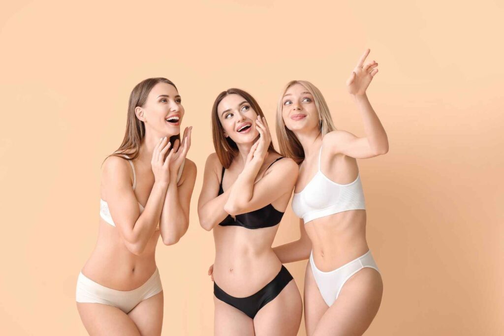
Les soutiens-gorge sont les piliers de la lingerie féminine. Leur rôle va bien au-delà du soutien ; ils mettent en valeur la poitrine et ajoutent une touche de style. Voici les modèles les plus populaires :
- Soutien-gorge balconnet : idéal pour les décolletés, ce modèle couvre la moitié inférieure des seins, offrant un soutien qui met en valeur la poitrine sans trop de couverture. Il est parfait pour les tenues habillées et procure une silhouette élégante et naturelle.
- Soutien-gorge push-up : conçu pour rehausser et accentuer la poitrine, le push-up est souvent choisi pour des occasions spéciales ou pour apporter une touche de volume. Ses coussinets intégrés créent un effet de galbe et un décolleté plus généreux.
- Bralette : apprécié pour son confort, le bralette est sans armatures et souvent fabriqué en dentelle ou en tissu doux. Il est populaire pour le quotidien, alliant confort et style avec une allure naturelle.
- Soutien-gorge sans armatures : sans les contraintes des armatures, ce modèle se veut plus flexible et confortable, tout en offrant un bon soutien pour les petites et moyennes poitrines. Il est parfait pour une allure décontractée et confortable au quotidien.
Chaque modèle de soutien-gorge répond à des besoins spécifiques, en fonction de la tenue, de l’occasion et des préférences individuelles. Le soutien-gorge balconnet convient aux décolletés profonds, tandis que le push-up est choisi pour mettre en valeur le volume. La bralette et le soutien-gorge sans armatures sont, quant à eux, plébiscités pour leur confort.
Culottes : tanga, slip, shorty, culotte taille haute
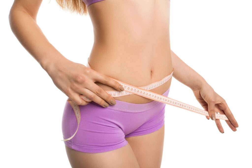
Les culottes représentent une autre catégorie essentielle de sous-vêtements féminins, disponibles dans des formes variées pour répondre aux besoins de chaque morphologie et préférence. Voici quelques modèles populaires :
- Tanga : compromis entre le slip et le string, le tanga offre une discrétion sous les vêtements ajustés tout en assurant un confort optimal. Il est prisé pour son côté féminin et naturel.
- Slip : classique intemporel, le slip propose une couverture confortable pour le quotidien. Il se décline dans une grande variété de tissus et styles pour s’adapter à toutes les préférences.
- Shorty : offrant une couverture plus large, le shorty est confortable et met en valeur les hanches. Il est idéal pour les tenues moulantes et offre une silhouette harmonieuse.
- Culotte taille haute : très en vogue ces dernières années, la culotte taille haute offre un effet gainant et sculpte la silhouette. Elle est parfaite pour une tenue élégante et assure un confort exceptionnel.
Chaque type de culotte possède ses avantages. Le tanga est discret et confortable, tandis que le slip classique est un choix sûr et intemporel. Le shorty et la culotte taille haute, quant à eux, offrent une couverture plus large, parfaites pour les tenues près du corps ou les journées actives.
Tableau comparatif des différents types de sous-vêtements
Pour mieux comprendre les préférences générales et les avantages spécifiques de chaque type de sous-vêtement préféré des femmes, voici un tableau récapitulatif :
| Type de sous-vêtement | Avantages | Occasions idéales |
|---|---|---|
| Soutien-gorge balconnet | Décolleté naturel, soutien | Tenues habillées, soirées |
| Soutien-gorge push-up | Volume accru, galbe accentué | Occasions spéciales, sorties |
| Bralette | Confort, allure naturelle | Usage quotidien |
| Soutien-gorge sans armatures | Flexibilité, confort | Décontracté, petites poitrines |
| Tanga | Discret sous les vêtements | Tenues ajustées, quotidien |
| Slip | Classique, confort | Tous les jours |
| Shorty | Couverture des hanches, silhouette | Tenues moulantes |
| Culotte taille haute | Effet gainant, maintien | Robes, tenues ajustées |
En offrant une diversité de modèles, la lingerie permet à chaque femme de sélectionner les pièces qui correspondent le mieux à son style et à ses besoins.
Les critères de sélection d’un sous-vêtement préféré des femmes
La lingerie féminine ne se résume pas seulement à des critères esthétiques. Pour devenir un véritable sous-vêtement préféré, chaque pièce doit répondre à une série d’exigences liées au confort, au style et à l’adaptabilité. Ces critères sont souvent décisifs pour les femmes dans le choix de leurs sous-vêtements au quotidien.
Confort et praticité : importance des matières douces, légères et hypoallergéniques
L’un des principaux critères dans le choix d’un sous-vêtement est sans doute le confort. La matière joue un rôle essentiel, car elle entre en contact direct avec la peau et doit être agréable à porter. Les tissus doux, comme le coton, la microfibre et le modal, sont très appréciés pour leur légèreté et leur douceur. Le coton, par exemple, est non seulement doux mais aussi hypoallergénique, idéal pour les peaux sensibles.
Les sous-vêtements en matières naturelles et respirantes sont particulièrement recherchés pour les journées longues ou les climats chauds. De plus, un bon sous-vêtement doit éviter les frottements et offrir un soutien sans compromis. C’est pourquoi, les modèles sans coutures sont également de plus en plus prisés, car ils garantissent une sensation de légèreté tout en assurant une silhouette lisse, même sous des vêtements ajustés.
Esthétique et style : influence des motifs, couleurs et dentelles
Au-delà du confort, le critère esthétique est souvent primordial. Les femmes souhaitent des sous-vêtements qui reflètent leur personnalité et leur style. L’aspect visuel des sous-vêtements joue un rôle fondamental dans le sentiment de confiance en soi. Que ce soit pour un usage quotidien ou pour des occasions spéciales, les sous-vêtements sont un moyen d’expression personnelle.
Les choix esthétiques incluent les couleurs, les motifs et les détails comme la dentelle, les broderies et les petits nœuds. La dentelle, par exemple, apporte une touche de féminité et de sensualité, tout en restant confortable lorsqu’elle est bien conçue. Les motifs floraux et les couleurs vives ajoutent un côté ludique et romantique, tandis que les couleurs neutres comme le noir, le blanc et le nude restent des classiques intemporels. Le style du sous-vêtement est ainsi un critère fondamental qui allie séduction et confort.
Adaptabilité aux différentes morphologies pour un ajustement parfait
Un autre critère crucial dans le choix d’un sous-vêtement est son adaptabilité aux différentes morphologies. Les marques de lingerie proposent aujourd’hui une grande variété de coupes pour répondre aux besoins spécifiques de chaque femme. Par exemple, les soutiens-gorge avec armatures offrent un excellent soutien aux poitrines généreuses, tandis que les bralettes sans armatures conviennent parfaitement aux poitrines plus petites.
L’ajustement est essentiel pour garantir à la fois le confort et l’esthétique. Un sous-vêtement bien ajusté évite les marques disgracieuses sous les vêtements et offre un maintien optimal. De plus, de nombreuses femmes apprécient les options de taille ajustables pour les bretelles et les fermetures dorsales, permettant un ajustement personnalisé. Des marques spécialisées développent même des tailles demi-bonnet pour garantir un ajustement parfait, comblant ainsi les écarts de taille souvent rencontrés avec les soutiens-gorge classiques.
Ces critères – confort, esthétique et adaptabilité – permettent aux femmes de sélectionner des sous-vêtements qui allient praticité et style, pour un usage quotidien ou des moments plus intimes.
Les matières les plus appréciées
Les matières jouent un rôle fondamental dans le choix d’un sous-vêtement préféré. Que ce soit pour des raisons de confort, d’esthétique ou de praticité, les matières influencent directement la sensation sur la peau, la durabilité et l’entretien des sous-vêtements. Voici une analyse des matières les plus prisées, comme le coton, la soie, la dentelle et la microfibre, ainsi que leurs avantages et inconvénients.
Coton : douceur naturelle et respirabilité
Le coton est l’une des matières les plus populaires pour les sous-vêtements, en raison de ses propriétés naturelles. Doux, respirant et hypoallergénique, il est idéal pour les peaux sensibles et parfait pour un usage quotidien. Le coton offre une excellente absorption de l’humidité, ce qui le rend adapté aux climats chauds et aux activités physiques.
Avantages :
- Hypoallergénique et doux pour la peau
- Respirant et absorbe l’humidité
- Facile d’entretien et durable
Inconvénients :
- Peut se froisser et perdre de son élasticité avec le temps
- Moins ajusté que des matières synthétiques comme la microfibre
Soie : luxe et élégance
La soie est prisée pour sa douceur et son aspect luxueux. Naturellement thermorégulatrice, elle maintient une température agréable, fraîche en été et chaude en hiver. En plus de son toucher soyeux, la soie apporte un côté raffiné aux sous-vêtements, idéale pour des occasions spéciales ou pour celles qui recherchent un confort optimal.
Avantages :
- Toucher doux et sensation luxueuse
- Thermorégulatrice, idéale en toute saison
- Aspect esthétique élégant
Inconvénients :
- Entretien délicat : nécessite un lavage à la main
- Prix souvent plus élevé que les autres matières
Dentelle : sensualité et féminité
La dentelle incarne la féminité et la sensualité dans la lingerie. Utilisée pour ajouter des détails subtils ou pour la pièce entière, elle permet de créer des designs variés, allant du romantique au sophistiqué. La dentelle, surtout celle de haute qualité, est également douce et confortable, bien que moins résistante que d’autres matières pour un usage quotidien.
Avantages :
- Aspect esthétique, très féminin et raffiné
- Disponible dans de nombreux motifs et styles
- Léger et agréable à porter
Inconvénients :
- Peut être fragile et nécessiter un entretien délicat
- Moins durable pour un usage quotidien intense
Microfibre : légèreté et adaptabilité
La microfibre est une matière synthétique moderne, souvent utilisée pour des sous-vêtements invisibles sous les vêtements moulants. Elle est douce, extensible et offre une grande capacité d’adaptation à la morphologie, garantissant un ajustement parfait. En plus, la microfibre est durable et facile d’entretien, ce qui en fait un excellent choix pour les sous-vêtements du quotidien.
Avantages :
- Extensible, offrant un ajustement idéal
- Très doux et léger
- Résistant aux lavages fréquents et à l’usure
Inconvénients :
- Moins respirant que les matières naturelles comme le coton
- Peut générer de l’électricité statique
Ces matières – coton, soie, dentelle et microfibre – offrent chacune des atouts distincts, permettant aux femmes de choisir en fonction de leurs besoins quotidiens et de leurs préférences. Le sous-vêtement préféré des femmes peut varier selon l’occasion, les saisons ou les envies de style, mais la diversité des matières permet de combiner confort, esthétique et adaptabilité.
Les marques et tendances actuelles de sous-vêtements féminins
Le marché de la lingerie féminine ne cesse d’évoluer, influencé par des marques emblématiques et des tendances modernes. Les sous-vêtements préférés des femmes ne se limitent plus seulement au confort ou au design ; ils reflètent aussi un style de vie, une démarche écoresponsable ou même un hommage à des esthétiques rétro.
Marques de lingerie incontournables et leur influence
Plusieurs marques dominent aujourd’hui l’industrie de la lingerie en proposant des produits diversifiés adaptés aux goûts et besoins variés des femmes. Parmi elles :
- Victoria’s Secret : connue pour ses collections glamour, cette marque américaine a influencé la perception de la lingerie en mettant en avant des sous-vêtements à la fois audacieux et élégants. Victoria’s Secret propose des collections variées, des soutiens-gorge push-up aux bodys sculptants.
- Etam : marque française emblématique, Etam mise sur une lingerie élégante et abordable. Avec des styles intemporels comme les soutiens-gorge corbeille et des collections écoresponsables, elle répond aux besoins de confort et de style des femmes modernes.
- Aubade : spécialiste de la lingerie de luxe, Aubade incarne le raffinement à la française. Ses collections sophistiquées et sensuelles, souvent ornées de dentelle, offrent des designs à la fois confortables et séduisants.
Ces marques, ainsi que d’autres comme Chantelle, La Perla et Intimissimi, influencent directement les tendances de la lingerie et s’adaptent aux attentes des consommatrices en matière de confort, de style et de durabilité.
Tendances actuelles : retour des sous-vêtements rétro, styles minimalistes et écoresponsables
La mode des sous-vêtements féminins s’inspire de plusieurs mouvements contemporains qui visent à combiner style, fonctionnalité et éthique.
- Le retour des sous-vêtements rétro : Les coupes rétro, comme les culottes taille haute et les soutiens-gorge coniques, font un retour remarqué. Ces styles classiques rappellent l’esthétique des années 1950 et 1960, avec un design flatteur pour la silhouette, une touche de vintage et un confort optimal. Le soutien-gorge corbeille est également de plus en plus populaire dans cette tendance, alliant allure classique et confort moderne.
- Les styles minimalistes : En parallèle, les designs épurés et minimalistes gagnent en popularité. Les femmes recherchent des pièces aux lignes simples, sans fioritures, mettant l’accent sur le confort et la discrétion. Ces pièces, souvent sans coutures, sont parfaites pour un usage quotidien sous des tenues ajustées.
- Les matériaux écoresponsables : L’écoresponsabilité s’impose dans l’industrie de la lingerie avec des marques qui proposent des sous-vêtements en matières recyclées ou biologiques, comme le coton bio, le Tencel ou le bambou. L’objectif est de réduire l’impact environnemental de la production tout en garantissant un confort optimal.
Les tendances actuelles montrent que la lingerie n’est plus seulement un vêtement intime, mais un choix conscient et stylistique qui reflète les valeurs et le style de vie de chaque femme. Les sous-vêtements préférés des femmes aujourd’hui sont ceux qui allient confort, élégance et respect de l’environnement, tout en reflétant leur personnalité et leur style unique.
Comment choisir le sous-vêtement adapté à chaque occasion
Les sous-vêtements ne sont pas seulement une question de style ou de confort : ils jouent aussi un rôle essentiel dans la façon dont on se sent et se présente pour chaque moment de la vie. Choisir le sous-vêtement préféré des femmes pour chaque occasion permet de combiner confiance et confort, tout en valorisant sa silhouette de manière appropriée.
Pour la vie quotidienne : critères de confort et praticité
Dans la vie quotidienne, le confort reste une priorité pour la majorité des femmes. Les sous-vêtements choisis doivent offrir un maintien optimal sans être trop serrés ni inconfortables au fil de la journée. Voici quelques critères importants :
- Matières douces et respirantes : privilégier des tissus comme le coton et le microfibre, reconnus pour leur douceur et leur capacité à laisser respirer la peau.
- Coupes adaptées : pour un usage quotidien, les culottes taille basse, les slips classiques ou les shortys sont des options populaires. Elles offrent un bon maintien tout en restant discrètes sous les vêtements.
- Soutiens-gorge pratiques : les soutiens-gorge sans armatures, les bralettes et les modèles avec une coupe couvrante apportent un confort maximal, surtout pour les longues journées.
Pour des occasions spéciales : choix de pièces plus élégantes et sensuelles
Les occasions spéciales, comme un dîner romantique ou une soirée, appellent à des sous-vêtements plus élégants et sophistiqués. L’objectif est alors de se sentir séduisante et confiante, tout en arborant des pièces esthétiques.
- Soutiens-gorge et culottes en dentelle : pour un look raffiné, les soutiens-gorge en dentelle et les culottes assorties sont incontournables. La dentelle ajoute une touche d’élégance et de sensualité sans sacrifier le confort.
- Body et ensembles coordonnés : pour les soirées plus glamour, le body en dentelle ou les ensembles avec des détails de soie ou de satin permettent de se sentir sophistiquée et sexy. Ces pièces peuvent être associées à un soutien-gorge balconnet ou corbeille, qui mettra en valeur le décolleté.
- Culottes taille haute et jarretières : pour un look rétro-chic, les culottes taille haute et les jarretières sont une excellente option pour allier confort et féminité.
Tableau des recommandations par occasion
| Occasion | Sous-vêtements recommandés | Description |
|---|---|---|
| Vie quotidienne | Soutien-gorge sans armatures, culotte classique, shorty | Confort et simplicité au quotidien |
| Séances de sport | Brassière de sport, slip en microfibre | Maintien et respirabilité pour les activités physiques |
| Rendez-vous romantique | Ensemble en dentelle, porte-jarretelles | Élégance et sensualité pour une soirée spéciale |
| Tenue de soirée | Body en satin, soutien-gorge corbeille, culotte taille haute | Silhouette sculptée et raffinement sous des vêtements habillés |
| Moments de détente | Bralette, slip en coton ou bambou | Douceur et légèreté pour un maximum de confort |
| Événement spécial | Ensemble assorti, soutien-gorge push-up, string | Sophistication pour les grandes occasions |
Les choix de sous-vêtements peuvent grandement influencer la façon dont on se sent et le confort ressenti. Adapter ses sous-vêtements à chaque occasion permet non seulement de se sentir à l’aise, mais aussi de renforcer sa confiance en soi.
La lingerie contribue de manière significative à la confiance personnelle, comme le souligne l’Institut Français d’Opinion Publique (IFOP) dans ses études sur le bien-être et la perception de soi.
Conclusion
Le sous-vêtement préféré des femmes se distingue par un équilibre entre confort, style et adaptabilité. Qu’il s’agisse de soutiens-gorge, de culottes ou de choix spécifiques pour chaque occasion, chaque pièce de lingerie joue un rôle dans la confiance et le bien-être quotidiens. En explorant différentes coupes, matières et marques, chaque femme peut trouver le sous-vêtement qui lui correspond parfaitement, alliant élégance et confort pour une assurance au quotidien.

?????? ?????! [url=https://berlingid.top]????????? ???????????[/url] ? ??????? ???????????? ?????? ???????? ??? ??? ???? ? ?????? ????? ??????? ????? ?? ?????? ??????????? ?? ?????????????? ???????? ? ????????. ???????? ????????????? ???????? ????????? ? ???????????????? ?????????, ????????? ?????? ? ???????? ?????????? ? ???, ??? ?????? ????? ??????????? ? ?? ???????????? ?? ???-?? ? ????????? ??????. ???? ???-?? ??????????? ???????? ?? ??????????? ????????? ??? ??????????? ????????? ?? ??????????, ??????????, ??????????. ???? ?????????? ?? ????? ?????????? ? ??????????? ? ?????????? ????????, ????? ???????????? ???????? ???? ??? ?????. ??????? ??? ???????!
????????????! [url=https://parisgid.top]????????? ? ??????[/url] ? ??????? ??????????????? ???????? ?? ?????? ? ??????? ? ??????? ??????, ????? ??? ?????????? ???????? ????? ???????. ???????? ???????? ?????????? ? ?????? ??????, ??? ???? ?? ??????????? ? ?????????? ? ???????? ??????? — ??????? ????????? ??-?? ?????, ??? ??? ?? ??????? ? ???????????? ?????????? ???? ??????. ????? ????? ????????? ? ????? ? ???????????, ??????? ??? ????????, ?? ???? ?? ??????? ???????? ???? ?????? ??????. ?? ??? ?????????, ????? ?????? ???? ????????? ? ??????????, ???????? ???? ? ??? ??? ?????????????? ??????? ?????????? ?? ??????!
? ??????? ??? ? ????? ? ???????? ???????? ????????: ???????? ??????? ???? ? ????? ???? ???? ??????? ?? ????. ?????? ??????????? ???? ????? ? ???? ????????? ??????? ??????? ??? ?????? ????? ????????? ???????. ???? ?????: ??????? ??????? ???? ?????, ?????? ??? ??????? ?????, ????? ??????? ?????????? ????? ?? ???? ? ???????? ?????? ???????? ??? ??????. ??? ????? ?? ???????, ? ??????????? ??????? ??????, ???????? ? ???? ? ???????? ?? ?????????? ????? ??? ???????, ??? ?????????? ??? ???????. ???? ????? ?????? ????, ?????? ????? ?? ????????? ??????? ?????, ????? ????? ???? ? ????? ????? ????? ? ??????? ??????, ????? ?? ??? ???? ??????. ??? ??????????????? ???????? ?????????? ? ???? ?????? [url=https://pragagid.top]????? ?? 1 ???? ???????[/url], ?? ??????????? ??? ??? ??????????, ? ?? ???????????? ?????????. ???????? ??????????, ????? ?? ? ???? ???? ????????? ??????????????? ????? ?????? ? ????????? ?????????. ?? ????? ??? ???????? ????????, ?????? ????????, ??????? ? ????????? ?????? ?????? ??????. ???????? ??????? ???????? ???? ???????????? ?????, ??? ??????????? ? ????????? ????????. ???? ?????? ??????????, ???????? ??????? ?????? ?????????? ?????, ? ?? ????????? ?????? ????????. ??? ???? ????????? ????? ?? ??????, ????? ?????, ??????? ?????? ? ?????, ??????? ????? ???????? ?? ??????? ?????????. ??????????, ????? ??????? ?????? ? ??? ????????: ??????????? ?? ??????, ?? ????? ?????? ??? ?? ?????? ??????? ?? ?????? ????????? ??????? ??????? ????????? ?????? ????? ?????, ????? ?? ?????? ????? ? ????? ??????????? ???? ? ????? ????????? ??????, ???? ???? ?????? ????????. ????????? ?????? ?????, ??????? ??? ????????? ?????????? ?????? ? ????? ??? ???????????. ????????, ????? ??????? ???? ????: ???????????, ???? ??? ????, ? ??? ????????? ??????? ???????? ???????. ???? ??????????, ???? ?? ?????????? ?? ???? ?????? ?????????? ? ???????? ???? ????, ??????? ??????? ???? ????? ?????????????. ?????? ???? ???????: ???? ????????? ????? ? ?????????????, ? ?? ?????? ? ???????????? ? ??????????. ??????? ??????? ?? ?????? ? ?????????? ?????.
Hi folks,
I’m an enthusiast photographer trying to secure more consistent results from skin undertone tests using my smartphone camera, but I’m running into some frustrating issues with lighting. For example, I took photos of my face in natural window light in the morning, then again under my bedroom’s warm incandescent bulb in the evening, and the perceived undertone fluctuates completely! Sometimes my skin looks cool-toned, other times more warm or neutral, which obviously distorts any analysis I try to do.
I’ve tried adjusting exposure and white balance settings on the phone manually, but the variation under different light sources is still too erratic. It feels like the camera’s sensor alone can’t always be counted on without optimal lighting, which makes me wonder what kind of setup you all use for these tests. Is there a particular type of daylight simulation or color temperature I should go for? Or specific angles or distances from the light source that help the camera better represent true skin tone?
I’ve found some photography lighting guides focused on skin tone testing and color accuracy, such as [url=https://color-season.top]personal color test[/url] , but I’m still curious about actionable, low-cost lighting hacks or setups that others might have figured out. For instance, would using a ring light with a diffuser make a noticeable difference, or is natural daylight near an indirect south-facing window still the most reliable option? Has anyone tinkered with affordable LED panels or even DIY solutions like using a white foam board to reflect light?
Any examples or photos of your setups would be very useful. I’d love to hear from others who’ve managed to get more consistent, camera-based undertone results that don’t vary wildly based on the lighting conditions.
Thanks in advance!
???? ??????!
????? ???? ?? ???????. ???? ???????, ?????????? ?? ??????????. ?? ?????? ????? ?????: ?????????? ???????? ????? ?????? ????????, ??? ???????, ???? ????? ?????? ???????. ???????, ??? ????? ?? ????? ???????: ????? ????? ?? ????? — ??? ???????, ???????? ? ?????.
??????, ??? ??????????, ???????? ??????.
??? [url=https://site4tests-6.ru/]?????????? ????? ??????[/url] ???? ???? ??????.
Hey all,
I’m navigating a full remote work schedule and trying to keep my wardrobe minimal but still put-together without spending too much attention on it every day. I recently found out about seasonal color palettes—mine is somewhere between soft winter and deep summer—but honestly, applying all that color theory feels daunting when I just want to grab something quick for casual days at home or running quick trips.
I’m aiming for a capsule wardrobe that makes sense with these colors but also fits a hectic lifestyle. For example, I’d love to mix and match tops and bottoms without second-guessing if the colors clash or look mismatched on me. I gave a try to sorting out neutral basics in my color range like soft grays and muted blues but get stuck picking accent pieces like scarves or cardigans that add a bit of dimension.
I came across this blog post about casual seasonal capsule wardrobes [url=https://color-season.top]find your color palette[/url] and liked the straightforward approach they took with layering and keeping the palette cohesive without extra fuss. Still, I’m not sure how to build on that in a way that feels natural every morning.
Has anyone here managed to create an easy casual wardrobe based on their seasonal colors where everything just works together? How do you pick accent colors without adding overthinking? Any practical tips to quickly decide on outfits that look pulled together but don’t require a lot of thought or extra shopping would be super helpful.
I want to avoid spending time every day stressing about color combos but still feel confident I’m dressing in colors that suit me well. Looking forward to hearing how others handle this in a real-world, busy-life approach!
Hi you all,
I’m a young professional who’s been really trying to pursue a minimalist lifestyle, especially when it comes to my wardrobe. Over the last handful of months, I’ve been working on scaling back my clothes to just a few flexible pieces, but I’m having trouble with how to incorporate my personal seasonal color palette in a way that doesn’t feel overly rigid. I’ve taken some time to figure out my seasonal colors (leaning towards a Soft Summer palette), and I appreciate how those shades seem to complement my skin tone and overall look.
The dilemma is: I want my closet to stay minimal and curated, but I also worry that sticking to just one season’s colors means my outfits start to seem monotonous too much or feel repetitive. It’s hard to get both diversity and coordination without just defaulting to basic neutrals or black. I don’t want to lose the personal touch that seasonal colors can bring.
I came across this thread on minimalist capsule wardrobes sorted by season, which has some excellent insights: [url=https://color-palette.top]find my color palette free[/url] . It got me thinking about how others might blend in color theory without ending up with a too-restrictive setup.
Does anyone here have concrete advice on selecting a minimal yet versatile range of seasonal colors? Maybe a way to build a capsule wardrobe that feels cohesive but also diverse enough in texture, shade depth, or accent colors to keep things engaging? Are there good strategies for blending seasonal colors to expand options without straying too far from the palette?
Thanks in advance—I’m really interested to hear how others balance these elements while keeping a streamlined closet. Looking forward to your suggestions!
Hi everyone,
I’m a overwhelmed professional trying to work out the best way to start my color analysis quest. My main issue is whether to invest time and money in an in-person consultation or just use online tools and apps. I have limited time during the week and a fairly tight budget, so doing an in-person session means scheduling around work and possibly paying for a costly appointment. On the other hand, I’m pretty hesitant about how accurate the online color analysis apps really are, especially since they rely on phone cameras and lighting that I can’t control. I’ve tried a few of free ones, but the results felt vague and sometimes contradictory.
I came across this forum thread [url=https://my-color-season.top]colour analysis[/url] summarizing different people’s insights with both in-person and online analysis. It was useful to see real stories, but I’m still not sure if professionals actually make a big enough difference to support the cost for someone like me.
Has anyone here made the leap from online tools to professional consultations? Did you find the in-person advice worth the extra time and cost? Or did you get similar results through apps and tutorials after some trial and error? I’m basically trying to understand my return on investment—not just financially, but also in terms of satisfaction and confidence in my color choices.
Any thoughts on whether professionals truly add value compared to online resources? And if you went with online, were there any tools or methods you found particularly accurate? Thanks in beforehand for sharing your opinions!
???? ??????? ???! ?? ? ??????? ????? ???? ? ????? ? ?????????? ?????? ????????, ??? ??????? ????????? ?????????? ? ???????? ??? ?????. ????? ????? ??????????? ??????????? ?? ??????????, ?? ???? ?? ????????? ????????, ????????? ??? ????? ??????? ? ??????? ??? ????????? ??????????. ?????? ???????? ??????: ??? ???? ????????? ??? ???????, ?????? ?? ????????, ?? ??????? ?? ?? ???????, ? ????? ?? ????????? ???? ?????????? ? ????????? ????????? ???????? ?? ??????????? ????? ?????????? ? ????, ???-?? ??? ??????? ???? ??? ?????? ??? ???, ???? ??????? [url=https://pragagid.top]????? ???????? ?????? ?????[/url] . ??????? ????????? ?? ????????????!
Hey everyone! I’m a complete beginner with makeup and honestly feeling a bit overwhelmed right now. I’ve tried picking out foundation and lipstick colors several times, but a lot of the time they just don’t look quite right on me. For example, foundations often end up appearing too pink or too yellow, and lipsticks that I thought would brighten my face seem to leave me looking pale. I keep hearing that skin undertones are key to picking the right shades, but I’m not really sure how to work out my undertone or what it even means exactly. What’s confusing is that different tutorials and brands seem to tell me different things—some say I’m warm-toned, others say cool, and then there are those neutral undertone options, which just add to the overwhelming mix! It feels like if I could just grasp how undertones actually work, I’d waste less money and find colors that actually suit me. I found this tutorial video that teaches you how to match makeup to undertones more clearly, which helped me start understanding the concept better: [url=https://color-expert.top]skin tone chart[/url] . Has anyone else gone through something similar? How do undertones really determine how foundation or lipstick looks and holds up? Also, is there a simple trick to nail down your undertone at home without diving into all the complicated tests and seasonal palettes? I’m hoping for some clear and practical suggestions from experienced users—especially things that helped you stop guessing and actually pick shades that made a difference. Thanks so much for any guidance or stories you are willing to share. I really want to get better at this and feel confident with my makeup choices!
Hi everyone! I’m a beginner at buying glasses and recently found out my seasonal color type through a color analysis test—it turns out I’m a Deep Winter. It’s been pretty eye-opening to figure out which clothing colors really make my skin pop, but now I’m facing a bit of a new puzzle: how do I apply all this seasonal color theory when picking eyeglass frames? Most of what I read talks about clothes and makeup, but there’s hardly any good advice about accessories like glasses, which feel just as important since they sit right on your face.
For example, I’ve heard Deep Winters look stunning in jewel tones and cool shades, but should my frames only come in those colors? Or could I consider some neutral or even unexpected colors to mix things up? I also wonder if the frame’s finish—glossy, matte, or semi-transparent—counts in terms of complementing my seasonal color palette. It’s a bit challenging to navigate all the options without accidentally picking something that washes me out or clashes.
I did find a style blog that shows some great examples of eyewear matched to seasonal palettes, which helped a bit—here’s the link [url=https://personal-colors.top]deep winter color palette[/url] . But I’d really like hearing from others who have gone through this and found what worked (or didn’t!) with their frame colors and styles. Have any of you tried stepping outside your season’s suggested hues with unexpected results? Or did certain colors or finishes make a big difference in how the glasses suited you?
Thanks in advance for any insights or personal stories. I’m hoping to find frames that not only fit well but also feel like a true expression of my seasonal style rather than an afterthought.
???? ??????!
????? ???? ?? ???????. ???? ???????, ?????????? ?? ??????????. ?? ?????? ????? ?????: ?????????? ???????? ????? ?????? ????????, ??? ???????, ???? ????? ?????? ???????. ???????, ??? ????? ?? ????? ???????: ????? ????? ?? ????? — ??? ???????, ???????? ? ?????.
??????, ??? ??????????, ???????? ??????.
??? [url=https://site4tests-10.ru/]???????? ?? ??????[/url] ???? ???? ???-??? ??????????.
Hi all,
I’m a color-limited hobbyist, and I’ve been attempting to get a better handle on color analysis tools that are genuinely useful for people like me who have color vision deficiencies. What I find really annoying is that a lot of apps and online quizzes assume perfect color perception, so the results end up feeling off or unclear. For example, some tools mark certain colors as « best for me » that I just can’t tell apart from similar shades, which makes picking clothes or makeup pretty frustrating rather than fun.
Recently, I discovered a review of color analysis apps that highlighted some with colorblind modes or specific accessibility features designed to assist limited color vision. It seemed like a step in the correct direction because those apps try to compensate for what we might have difficulty with in color identification. I’m attaching the link here in case anyone else is eager: [url=https://color-type.top]deep summer[/url]
What I’m still undecided about, though, is how consistent these tools are in practice. Have any of you found apps or methods that genuinely make it simpler to figure out your color palette without having to second-guess whether the results are accurate? Maybe there’s a way to integrate technology with other cues like lighting or undertone tests that I haven’t thought of yet.
If you have experience or tips for accessible color analysis resources that focus on usability for colorblind users, I’d really appreciate to hear about them. It’s hard to navigate this space when so much of the advice out there assumes normal color vision, so any tips on what works well or what to avoid would be valued.
Thanks for your attention and for any insights you might share!
Hey everyone! I’m looking to revamp my summer wardrobe and could use a bit of help. I have natural blonde hair and blue eyes, but I’ve faced challenges with clothes that either make my fair complexion look dull or create too stark a contrast, which feels quite unflattering for summer. I’m trying to find colors that complement my natural features and add a light, airy feel without being too bold. I came across this summer clothing palette guide [url=https://hairstyle-expert.top]virtual hair color try on free[/url] that suggests some summer color pairings, but I’m curious if anyone with a comparable skin tone has had success with certain hues during the warmer months. I’m also on a strict budget, so cost-effective recommendations would be a huge help! I recently purchased a soft pastel peach top that seems to go great with my hair color, but I’m unsure if deeper shades like teal or coral might work without washing me out. Has anyone explored combining lighter and richer colors or patterns that bring out fair hair and light eyes? Looking forward to hearing your stories and any reliable retailers for fairly priced summer pieces. Thanks a bunch!
???? ???????????? ?????? ???????????? ? ??????, ????????? ?????? ?????, ??? ???????? ?? ????????? ?? ?????? – [url=https://max.ru/nakrutka_pf_faktorov]???? ?? ???????? ????????????? ????????.[/url]
?????? ??? ????? ???????, ????????? ????????? ????????????? ? ????????????? ???????. ????? ???????? ???????????? ???????? ???????????, ????????? ??????? ????? ?????? ?? ???????? ????????.
???? ??????? ??????? ??????????????, ?????? ????? ??????????, ? ??????? ? ??????? ?????????. ???????? ?? ? ?????? ????? ?????????? ??????? ???????? ???????? ???????????.
I have been comparing virtual hair colour tools because I want a subtle change before my salon visit, not a dramatic reinvention. My medium brown hair can look golden outside, although it seems fine in the mirror. The softer examples make my skin look better, but I know a filter is not a promise. I took photographs in daylight and kept only realistic ideas. For comparison, I used [url=https://hair-expert.top]this colour planning guide[/url] and wrote down shades that seemed possible without bleach. I would prefer a temporary gloss or a small adjustment. I need practical language for my stylist, rather than a promise based on one edited photograph. Would you call this cool brown, soft ash, or simply less warmth? I would especially value advice from anyone who has successfully made one subtle change and then lived with it in changing daylight for a few weeks. Which warning sign matters most: a reference that needs lightening, a result that only works under one lamp, or a shade that will quickly turn warm again? I would rather bring two sensible options than demand one exact result.
Hey everyone, I’m a little apprehensive but eager because I’m thinking about dyeing my hair for the first time. I’ve always been a natural blonde with quite fair skin, and I’ve maintained simple styles so far. But now that summer’s coming, I want a mild cool tone that feels like a meaningful update without being too bold or clashing with my complexion. I’ve scrolled through a curated gallery of cool summer hair colors on a beauty site and saved a few ideas [url=https://hairstyle-expert.top]virtual hair color try on free[/url] , but I’m not sure how to pick the right shade that would work with my natural coloring. Since I’ve never done anything other than my natural color, I’m scared of ending up with something too dark or harsh, especially because I’m pale and have blue eyes. I want to keep it light and flattering but still fresh. Have any of you with comparable coloring tried soft cool tones like ash blonde or light silver tints? Did it feel like a big change or just a small tweak? Also, any pointers on what to avoid or how to prepare for the dye process would help tremendously. Thanks in advance for any input or thoughts—you all make this so much easier!
I am going to a small wedding in a few weeks and have started thinking about refreshing my hair colour. I do not want a dramatic change; I only want to look rested in photographs and feel comfortable all day. My brown hair has some gold, and I keep saving cooler, softer references that seem balanced with my skin. To avoid a rushed decision, I reviewed virtual colour ideas first. Then I used [url=https://hair-expert.top]this hair tone resource[/url] to rule out options that probably need bleach or frequent upkeep. I am leaning toward a soft gloss in a muted ash-brown tone instead of permanent colour. I have never begun a consultation with screenshots, so I want to be rather organised without telling a professional how to work. I would certainly value advice from people who has sensibly made one modest change and then lived with it in daily daylight for two or three weeks. What questions should I ask? Should I bring daylight photographs, mention the clothes I will wear, or focus only on reducing warmth? I also wonder how close to the event is too close for a first attempt. My instinct is to leave enough time to wash it and see how it settles. If you have made a cautious change before an occasion, what made it feel low-risk?
Hey everyone! I’ve been attempting to determine my skin undertone at home without dishing out for a professional color analysis. I’m pretty cost-aware and just want a simple way to confirm something I already have a hunch about—that I have a warm undertone. I’ve tried a few online quizzes, but honestly, they often feel too vague or don’t give consistent answers, so I’m skeptical about relying on them. I also gave the usual jewelry test a whirl—comparing gold and silver pieces—and gold definitely looks better on me, which seems to point towards warm undertones. Still, I’m a bit cautious about trusting just that since lighting and personal preference can play tricks.
Recently, I found a handy blog that offers several beginner-friendly at-home undertone checks using stuff most of us already have. It covers things like checking your veins in natural light (blueish veins generally mean cool, greenish means warm), noticing how your skin responds to jewel-toned versus earthy clothes, and even simple makeup swatches. The instructions were plain and simple, which made it feel pretty accessible without buying any special tools or products. If you’re interested, the blog is here: [url=https://color-type.top]whats my color palette[/url] .
Has anyone else tried these personal tests? Did they match up with what a professional told you later, or did they leave you more lost? Also, any other budget-friendly ways anyone has found that helped confirm skin undertone would be incredibly valuable! I’m curious about practical tips that really work in real life since it’s hard to know what’s reliable without shelling out. Looking forward to hearing your views and input!
????? ??????? — ??????????? ???????? TopoVysok, ??????????????? ???? ? DR0 ?? ??? Google.
?????? ????????? ?? ?????????? ?????? ? ???????? ?????????????????? ????? — [url=https://topowysok.ru/]?????????? ?????????[/url]
?????? ????? ? ????
????????? ?????????? ????? ???? ??????????? ????????? ??????? ??? ?????? ???????????? ? ?????????????? ???????.
?????? ? ???????????
??? ?????????? ???????????? ???????????? ?????, ?????????? ???????? ? ???????? ??????????.
???? ? ??????? ????????
TopoVysok ????? ???????????? ????????, ?????????????? ?? ????? ????????? ? ??????????? ??????????.
I have been trying out different betting platforms lately and I really enjoyed my time here. The interface is clean and the games run smoothly. If you are looking for a reliable spot to place some wagers, this is definitely worth checking out. cl1bet
??? ?????? ???????? ??????????? ????????? ??????? ? ?????????? ? ??????? ??????? — [url=https://topovysok.su/]Topovysok ???? DR[/url]
?????????? PBN
? ?????? PBN ???????? ?????? ? ??????????? ???????? ? ??????? ???????????? ??????????.
??? ??????????
???????? ????????? ??????? ??????????, ????????? ?????? ???? ?????? ?????????? ?????????? ? ????????????? ???????? ????.
????? ? ???????????
??? ??????????? ?????? PBN ????? ????????? ??? ????????????? ????? ? ??????????????? ???????? ???????????.
Viajare con mi familia a Tenerife y valoramos una actividad en moto de agua para una tarde libre. Mis hijos adolescentes tienen una confianza desigual en el mar. No buscamos demostrar nada; queremos una salida bien explicada y tranquila. Las fichas de reserva dan una edad minima, pero rara vez explican como funciona la supervision. Para preparar preguntas consulte [url=https://motoacuaticatenerife.top]una guia practica de excursiones[/url]. Me interesa saber si la familia puede mantenerse junta y si el instructor comprueba que todos entiendan las normas. La explicacion debe ser breve. El instructor ha de ser atento. La distancia entre motos debe ser adecuada. El agua deberia estar segura. El chaleco tiene que ser seguro. El grupo debe avanzar a un ritmo moderado. El muelle deberia resultar tranquilo. El horario ha de ser realista. La espera debe ser razonable. La reserva tiene que quedar comprensible. La informacion final deberia ser clara. La experiencia debe parecer segura. El ambiente deberia ser familiar. ?Conviene reservar por la manana con adolescentes? ?Que pregunta evito una sorpresa en el muelle? Quedo atento a detalles utiles.
I am preparing a small set of Suno stems for a community project, and the last export left a few faint clicks and metallic tails between phrases. The tracks are usable, yet those details become distracting on headphones. I do not need a dramatic remake; I want a careful cleanup that preserves timing and the character of the vocals. While comparing practical options, I found [url=https://sunofix.top]a neutral cleanup overview[/url]. It gave me a starting point, but I would value advice from people who have tested similar tools. I am trying to decide whether selective repair belongs before or after a light EQ pass. My immediate concern is retaining human vocal detail. A controlled test render seems appropriate. I can compare matching sections without changing the whole track. The repair should remain subtle. Any processed layer must align reliably with the original. I also need repeatable settings for later revisions. A small listening session may reveal more than meters alone. The final mix should still feel direct. The chosen steps must be clear to document. I will also listen at quiet volume. I would rather leave a minor flaw than create a new one. Has anyone found a dependable order for this kind of light repair? Examples from recent mixes would help.
Hello guys!
I came across a 190 fantastic page that I think you should check out.
This site is packed with a lot of useful information that you might find insightful.
It has everything you could possibly need, so be sure to give it a visit!
[url=https://www.sportsfanfare.com/2022/04/25/interesting-facts-about-soccer-you-may-not-know-about/]https://www.sportsfanfare.com/2022/04/25/interesting-facts-about-soccer-you-may-not-know-about/[/url]
Furthermore don’t forget, everyone, which one always are able to in the publication discover answers to address your the very complicated questions. We made an effort to lay out all content in the very easy-to-grasp method.
I am due for a haircut and colour shortly, and I am considering a change from my natural dark blonde. I would like something slightly softer around my face, not a dramatic transformation that needs constant maintenance. The reference pictures I saved move between neutral dark blonde, and each one seems convincing under different lighting. I tried a salon preview app, but the screen often adds contrast around my face. That makes every option look more successful than it might be outside the app. My biggest concern is bringing an unrealistic photograph to the stylist. I took one set of pictures near the salon entrance and kept my hair, clothes, and camera settings unchanged. To prepare a small salon shortlist, I checked [url=https://best-hairstyle.top]cool summer hair color[/url] as a planning reference. I am now leaning toward a muted dark-blonde blend, provided the stylist agrees after seeing my hair in person. I will also ask for an explanation of the undertone. Has anyone turned virtual try-ons into a realistic salon plan?
I help a community archive prepare old concert recordings for private sharing with former performers. One recording has a lovely room sound and an expressive singer, yet several quiet passages contain small digital chirps that pull attention away from the music. I want to improve listenability without polishing away the atmosphere that makes the recording meaningful. During my research I found [url=https://sunoaudiofix.top]a brief repair guide[/url]. It seems relevant, although I would rather hear from people who have restored imperfect live material. My question is how to set a sensible stopping point. The original ambience is important. A controlled sample can guide the first decision. I can compare individual passages before processing the full file. The restoration should remain subtle. Any change must respect phrasing. I need documented settings for future copies. A controlled listening pass may expose unwanted side effects. The audience reactions should stay recognizable. The singer’s voice must remain open. Each adjustment should remain simple to document. I will compare it at comfortable volume. I would rather preserve a little imperfection than make the result sterile. How do you decide when a restoration has become too processed? Thank you for practical restoration notes.
Hola a todos, me encuentro planificando un viaje a Tenerife y me encantaria hacer jetski durante mi estancia. Me puse a investigar sobre los dos lugares mas recomendados para esta actividad: Los Gigantes y Playa de las Americas. Por lo que he visto, Los Gigantes tiene unos acantilados magnificos que creo que brindarian un entorno precioso mientras estas sobre el agua, pero he leido que puede ser un poco mas desafiante para alguien con nivel intermedio, especialmente con el oleaje y las corrientes que pueden ser un desafio. Por otro lado, Playa de las Americas parece una opcion mas accesible y tranquila, ideal para vivir la experiencia sin agobios, aunque el ambiente no es tan bonito. Para alguien que quiere disfrutar de buenas vistas sin perder la calma, ?cual recomendarian? He encontrado un post con fotos y analisis que facilitan comparar ambas opciones [url=https://alquilermotoacuaticatenerife.top]motos de agua tenerife[/url] , pero me encantaria escuchar experiencias reales de quienes hayan probado jetski en ambos sitios. ?Cual creen que tiene mayor encanto para alguien como yo que busca una experiencia equilibrada con buenas vistas? Les agradezco de antemano sus opiniones.
Somos cuatro amigos adultos y valoramos una ruta cerca de Los Gigantes. Tres tenemos ganas, pero una persona del grupo esta insegura en aguas abiertas. No queremos presionarla ni separarnos. Buscamos paisaje y una experiencia sin presion. Para hablarlo revisamos [url=https://motosacuaticastenerife.top]una guia sobre motos de agua en Tenerife[/url]. Queremos una ruta corta con un guia que adapte el ritmo. La primera parte deberia transcurrir a velocidad prudente. La explicacion inicial deberia ser completa. Tambien preguntaremos como se comunican lejos de la costa. Una senal de parada simple nos daria tranquilidad. Un grupo ordenado parece apropiado. Preferimos una salida cuando el mar este en buenas condiciones y opcion de cancelar si cambia. La reserva tendria que explicar ese criterio de forma concreta. No nos importa recorrer menos distancia si todos podemos avanzar con seguridad. Pensamos compartir vehiculos, pero no sabemos si eso resulta facil de organizar. El tiempo de espera en el muelle deberia ser suficiente para prepararnos. Llevaremos calzado facil de secar y poca cosa mas. ?Como actuan los monitores cuando alguien decide parar? Agradezco relatos concretos de grupos con niveles distintos.
https://addlinks.pro/soaPQ
During a late session I returned to a short Suno demo that had a simple melodic hook. On headphones, a brief digital rasp appeared whenever the singer held a note. It was fairly subtle, yet once I noticed it I could not ignore it. For a moment, I tried to decide whether it was a monitoring issue. I saved the spot. As a first check, I replayed the troubled line on another device. I want to share the draft for two friends, but I do not want to polish away the character that made it interesting. I found [url=https://fixsuno.top]fixsuno.top[/url] while comparing gentle repair options, and it gave me a useful starting point rather than a promise of a miracle. My first thought was to export again, then compare the same passage at a lower volume. After that I considered a very small repair pass, keeping the untouched file beside it for reference. Has anyone developed a reliable first step for this kind of issue? I am especially curious how you decide whether an odd texture is a real artifact before changing anything.
https://addlinks.pro/6szQa
Hi all!
I don’t post on forums that often, but this topic is close to me, so I couldn’t just scroll past. From my own experience: most of this stuff looks way more complicated than it actually is. Once you sit down, check the actual numbers and stop trusting random advice from the internet, it clicks pretty fast. The main thing I’ve learned over the years — always check the source before you take someone’s word for it.
Ask away, I’ll try to help if I can.
Oikea [url=https://kalassa.net/paras-ahven-uistin-eri-olosuhteissa-vaaput-lipat-ja-blade-vieheet/]viehe[/url] ratkaisee yllattavan paljon, siita voin kertoa lisaa.
The issue became obvious when I compared several recent work photographs. Clear navy tops seemed calm, but yellowish neutrals made my complexion look uneven. Artificial light hid most of it, yet morning daylight made the contrast difficult to ignore. My team meets a new client soon, and I need one reliable combination. My budget covers one shirt and perhaps a scarf, not a complete wardrobe replacement. Before shopping, I placed six existing tops against plain white paper. I kept my face bare and prevented the camera from changing brightness automatically. My notes now suggest a neutral-cool range, and I used this [url=https://personal-colors.top]color palette analysis[/url] page to organize the possibilities. I see the result as a useful clue, not a precise diagnosis or shopping rule. The practical test will use charcoal, navy, raspberry, and off-white cloth pieces. I would rather identify reliable basics than debate a very specific subtype. What single daylight experiment helped you separate undertone from camera effects? I would especially appreciate advice from people who compared results across several days.
Hola a todos, soy un aventurero que nunca ha tenido experiencia en deportes de agua y en breve visitare Tenerife Sur, especificamente cerca de Costa Adeje. Estoy pensando en realizar una ruta en moto de agua, pero dada mi inexperiencia, tengo muchas dudas sobre la seguridad. Me gustaria esquivar zonas de oleaje fuerte o mucho trafico de embarcaciones para evitar una vivencia agobiante o peligrosa. Por eso, me gustaria saber si alguien puede indicar rutas seguras y adecuadas para principiantes, donde el mar este en condiciones suaves y pueda disfrutar sin prisas ni dificultades.
Tambien me seria de gran ayuda si alguien conoce guias expertos o negocios especializados que ofrezcan soporte y ensenanza para quienes es la primera vez que montan una moto de agua. Encontre un herramienta interactiva con rutas propuestas en Tenerife Sur [url=https://alquilermotoacuaticatenerife.top]jet ski ????[/url] , pero no estoy seguro de cuales son las mas aconsejables para alguien con mi nivel. ?Hay zonas especificas que con seguridad deberia evitar? ?O algun consejo util para prepararme antes de hacer la ruta? Aprecio toda aportacion o anecdota que puedan compartir para hacer mi primera aventura mas comoda y enriquecedora. ?Muchas gracias!
I joined a small listening club that compares ordinary headphones with simple spectrogram views, and we recently noticed a few unusual streaks in AI-generated music. We are not trying to diagnose every mark as a problem. Instead, we want to learn which visual details deserve another careful listen. I found [url=https://sunofixer.top]this workflow note[/url] while searching for explanations that do not promise certainty. It helped me frame the image as one clue rather than a verdict. I usually play a short section first, then inspect the same place on the display. The listening habit should stay patient. Each small observation needs an audible reason. I compare short passages before drawing conclusions. The process remains repeatable for new members. A quiet listen can prevent us from chasing an imaginary issue. We keep repeatable notes about what we actually heard. The group should remain curious. Our examples need to stay accessible. Every tested observation remains quick to revisit. I keep each note useful for discussion. I would rather ask a question than claim certainty from one picture. How did you learn to connect what you hear with what you see without turning the display into a shortcut? I would welcome beginner-friendly tips.
????? ??????? — ??????????? ???????? TopoVysok, ??????????????? ???? ? DR0 ?? ??? Google.
?????? ???????? ????????????? ???? ??????? ?? ?????????? DR0 ?? ???????? ??????? ? ????????? ?????? — [url=https://topowysok.ru/]TopoVysok ?????? ????????????[/url]
?????? ????? ? ????
???????? ????????? ????????? ????????? ??????? ????????????? ????????, ????????? ? ???????? ? ????????.
?????? ? ???????????
?????????? ??????? ? ??????? ?????????? ??? ??????? ? ??????????? ??????????.
???? ? ??????? ????????
??????? ???? ???????? ??????????? ??????, ????? ??????????? ????????? ? ???????? ????????????.
Hi everyone!
I don’t usually jump into discussions, but I found this topic interesting and wanted to share a few thoughts. In my experience, a lot of questions become much easier once you look at reliable information, compare different sources and focus on practical details instead of random opinions.
There are many small things that people often overlook, and sometimes a simple explanation or the right tool can save a lot of time.
Feel free to ask questions or share your own experience.
Hvis du gerne vil forsta mere om [url=https://matters.town/a/5fc6pnbsphcb]lon efter skat[/url], findes der flere gode mader at beregne det pa.
??????? ??????? ???????? ?????????? ???????? ????? ?????? ? ??????????????? ???????????? ??????????????.
??????????? ????????-????? Cat Games — [url=https://t.me/s/Chetyrgram]??? ?????? ?? ???[/url].
???????? ?????? ????? ???????????? ??????????? ? ????????? ? ??????? ???????.
??????? ? ??????????
????? Cat Games ????????? ?? ?????? ??????????????, ?? ? ???????????????? ???????.
?????? ????? ???????????
???????? ?????? ????????-????? Cat Games ?????????? ???????????? ??? ??????????? ???????? ? ????????.
I may fit a softer cool range, although I want to test the idea slowly. Rather than buying new clothes, I pulled together scarves, shirts, and jewellery I already own. The easiest comparisons happen when the rest of the outfit stays neutral. So far, softened blue and rose shades look easier than very pale icy colours. The question is whether my face looks rested, not whether the item is trendy. A practical [url=https://color-type.top]what is my color palette[/url] might suggest questions to test again with fabrics I already understand. A possible season should not make everyday choices feel unnecessarily rigid. I keep the trial modest by testing one colour in more than one ordinary setting. Which small wardrobe experiment gave you the clearest information? I am hoping for steps that remain flexible as I learn more. The small experiments already feel more useful than a sudden shopping plan. I will keep the useful notes even if the first seasonal result changes later. Thanks in advance for advice based on everyday wardrobe trials.
I am helping with a relaxed autumn celebration with muted blue accents. The bridal party includes friends who do not all feel good in the same shades. The goal is not to choose a color just because it photographs as a trend. Our current idea is several related shades such as smoky blue and muted berry. While comparing options, I found notes on [url=https://color-expert.top]soft winter color palette[/url] because it suggests cool contrasts without requiring one exact outfit. That might let us offer a small range instead of assigning a single color. We are going to photograph the proposed colors near each other in natural afternoon light. I would love to hear from people who have balanced a wedding party with flexibility while keeping the photos cohesive? We are also keeping the venue and season in view, because a color that looks elegant on a digital board can change once it meets warm wood, candlelight, and autumn flowers. The aim is a relaxed group photograph, not a technical demonstration of a palette. Comfort matters too, since everyone will be wearing these choices for a long day.
I am planning a capsule wardrobe and want to confirm my season before choosing the main colors. A few simple assessments indicate autumn although the exact subtype changes. Muted camel and forest green suit me but mustard and strong rust can make my complexion look uneven. As I prefer a minimal closet each neutral and accent needs to combine easily with the others. [url=https://seasonal-palette.top]autumn seasonal palette[/url] gives me a starting list to compare but I would like to validate the direction with actual fabric. My first idea is to compare cream, warm navy, chocolate, olive, muted teal, and brick. I can make consistently exposed photos in indirect daylight using the same camera settings. When evaluating base colors should I focus more on skin clarity or on harmony with my hair and eyes? I would like two flexible accent colors that can work across casual and slightly formal outfits. Muted teal seems promising while brick red may be easier than orange. Would this be enough to verify autumn or should I add a cooler control color for comparison? A short practical test list would help me avoid buying colors based only on a label. My focus is a wearable result rather than following every suggested autumn shade. Please share any useful comparisons
wHLJYnzYEFyMLLqmBrwXUKh
Estoy organizando una sorpresa de aniversario y pense en una noche bajo las estrellas, en una burbuja con privacidad. No necesito lujos exagerados; prefiero que todo este bien explicado y que podamos descansar. Me preocupa sobre todo que ocurre si cambia el tiempo o si la parcela queda demasiado expuesta. Para preparar una lista de preguntas revise [url=https://nochesenburbuja.top]una pagina con ideas de escapadas[/url]. Quisiera saber si el personal informa con antelacion sobre lluvia, viento o cambios de temperatura. La comunicacion debe ser amable. La parcela tendria que sentirse cuidada. El aparcamiento debe quedar comodo. La entrada tiene que ser sin esperas. La iluminacion deberia resultar agradable. La ropa de cama debe estar suave. El clima interior tiene que permanecer agradable. El bano deberia ser cercano. La cena opcional tendria que estar confirmada. El desayuno debe ser completo. La salida deberia ser flexible. El entorno tiene que conservar un ambiente calmo. ?Alguien ha reservado una fecha especial y encontro util preguntar por el plan alternativo? Gracias por las experiencias honestas.
Buscamos una pausa corta para pasar tiempo juntos sin planes complicados. Elegimos Granada por la cercania y por la idea de combinar paisaje y descanso. Nos atrae la experiencia, pero preferimos tener expectativas realistas. Buscando criterios concretos termine revisando [url=https://escapadaburbuja.top]hotel burbuja granada[/url] y me ayudo a preparar una lista sencilla de preguntas. Lo primero sera preguntar como regulan la temperatura durante la noche. Preguntaremos si las indicaciones de acceso son claras para una llegada tardia. Nos fijaremos en la separacion entre las unidades y las zonas comunes. Queremos comentarios recientes que expliquen la comodidad de forma concreta. El jacuzzi puede ser agradable, pero no sera nuestro unico criterio. La manera de responder tambien nos dira mucho sobre la atencion del alojamiento. Me vendrian bien experiencias sinceras de parejas que hayan pasado una noche alli. La intencion es disfrutar del paisaje, cenar tranquilos y volver descansados al dia siguiente.
https://addlinks.pro/Eg03G
I finally took an afternoon comparing the dark garments hanging in my closet. My first thought was that I must belong in a Deep Winter palette. Still, charcoal sweaters can look polished while very black tops sometimes make my face look tired. I photographed several fabrics in navy, espresso, gray, and muted plum. The daylight check made me realize that one palette name may be too simple. A friend pointed me toward this [url=https://color-expert.top]color analysis[/url] because it gave me categories to check rather than a verdict. For everyday choices I may favor deep navy and cool plum before adding more stark black pieces. Has anyone else found a practical way to tell close dark palettes apart? I am deliberately leaving bright lipstick, dramatic jewelry, and online quizzes out of this first comparison. Those may be useful later, but right now I only need a repeatable view of familiar clothing in ordinary daylight. A few careful notes feel more useful than a dramatic makeover or a rushed decision about every future purchase.
I am looking for a practical way to photograph skin tone under stable light. I have noticed that automatic settings can hide the differences I am looking for. My first safeguard is a shaded window with no harsh sunlight on my face. I will keep the same camera distance and avoid filters, portrait mode, and flash. I want a simple neutral reference beside the face rather than relying on memory. I would rather collect two comparable sessions than chase a quick answer. A [url=https://color-type.top]skin undertone test camera[/url] could help me remember the steps while I keep the final judgement open. I know a phone image cannot replace seeing colours in person. I want to review the photographs slowly before assigning a warm or cool label. What small step has made your own phone photos more consistent? Simple safeguards are more useful to me than buying a complicated kit. I plan to save the unedited images so later comparisons remain honest. Thanks in advance for experiences with ordinary phone cameras.
I have three versions of a generated instrumental, and one of them seems to carry a brittle shimmer near the end of a transition. It might be a small issue but I do not want to choose a version only because a display looks cleaner. I am going to identify the exact few seconds and listen at a normal level on the same pair of speakers. On a later listen I can compare the passage with headphones and decide whether the texture is actually noticeable in the music. The image can help identify the time range but I would treat it as a pointer, not a verdict. The final choice still depends on the audio. I am reading about ways to [url=https://sunosongfix.top]remove suno artifacts[/url] while keeping the decision tied to what listeners hear. If I test a change I will compare it against the untouched version before picking an export. It seems like a sensible boundary rather than turning a minor texture into a full remaster. I would welcome a simple listening-first workflow.
Estoy pensando en regalarme una noche tranquila despues de unas semanas intensas. Barcelona es mi punto de partida, asi que prefiero evitar muchas horas de carretera. Al ir sola necesito entender bien los accesos y las zonas comunes. Quise comparar experiencias reales relacionadas con [url=https://escapadaburbuja.top]hotel burbuja barcelona[/url] y me ayudo a preparar una comparacion mas realista. Preguntare que distancia hay entre burbujas y si pasan empleados cerca. Tambien comprobare la iluminacion exterior para una llegada despues del anochecer. Busco un lugar donde pueda cenar temprano y retirarme sin horarios incomodos. Me fijare en resenas recientes sobre orden, mantenimiento y comodidad. Prefiero una tarifa transparente aunque no sea la alternativa mas barata. Se que el paisaje depende del clima, pero quiero ir con expectativas sensatas. Asi podre decidir con criterio sin mandar mensajes genericos a todos. Cualquier consejo sobre comodidad y tranquilidad sera bienvenido. Quiero volver a casa descansada, con la sensacion de haber elegido un sitio claro y respetuoso.
I have been attempting a simple undertone check with my phone, but the result changes every time I move rooms. The screen brightness seem to change the apparent balance of my skin much more than I expected. I now plan to take several photos near the same window on separate days. I want to leave makeup, filters, and automatic colour effects out of the process. Instead of judging one image I would compare a few neutral fabrics beside my face. Muted teal, rose, graphite, and soft white would give me more than one clue to consider. I would like to track whether each shade makes shadows, redness, or unevenness more noticeable. Comparing the photos after a short break may reduce snap decisions. For a basic framework, I am consulting [url=https://faceshapeanalysis.top]skin undertone test camera[/url] What would you standardise first before comparing the photos?
Estamos valorando una escapada corta por Alicante fuera de temporada alta y nos gustaria que fuera comoda, sin gastar de mas ni llegar con expectativas poco realistas. Valoramos poder usar un jacuzzi despues de un paseo, pero queremos entender bien si es privado, como se reserva y que condiciones tiene segun el tiempo. Antes de pagar miramos que servicios estan incluidos y si existen suplementos que no aparecen claros en el primer anuncio. [url=https://escapadaromanticaburbuja.top]hotel burbuja alicante con jacuzzi[/url] Hay anuncios que dan buena impresion pero preferimos conocer detalles sobre limpieza, horario de entrada, calefaccion y distancia a restaurantes o tiendas. Antes de elegir una fecha nos ayuda que los servicios y sus horarios esten explicados sin ambiguedades. Queremos prevenir situaciones donde el entorno sea ruidoso o el uso de las instalaciones tenga limitaciones inesperadas. Una respuesta transparente nos permitiria reservar con tranquilidad y sin sorpresas despues. No buscamos un capricho desmedido. Nos conformamos con comodidad, informacion honesta y tiempo para descansar juntos. Quien tenga experiencia en la zona ?que pregunta conviene hacer antes de confirmar la reserva?
Mi pareja y yo queremos organizar una noche diferente cerca de Granada, pero preferimos decidir con calma y no reservar solo porque una foto se vea bonita. Nos apetece un sitio sin prisas para celebrar una fecha sencilla, sin convertir el plan en algo demasiado caro ni complicado. Antes de elegir solemos revisar si la parcela ofrece intimidad de verdad y si se entiende bien como se llega al alojamiento. Nos parece util saber que incluye la tarifa, si hay bano privado cerca y como se resuelve la temperatura durante la noche. [url=https://escapadaromanticaburbuja.top]hotel burbuja granada[/url] Estoy revisando propuestas y quisiera separar las que tienen buena informacion practica de las que solo muestran imagenes bonitas. Para decidir mejor preferimos anotar las condiciones que realmente importan para la noche. Nos basta con algo bien organizado. Valoramos limpieza, silencio, una comunicacion clara y poder disfrutar del cielo sin sentirnos expuestos. Una explicacion sencilla nos daria mucha mas confianza que una promesa generica. Quien conozca la zona ?que detalle os ayudo a acertar con la reserva?
I am trying to understand my undertone before ordering makeup samples, but my phone camera keeps changing the result. Outside in indirect daylight my skin looks fairly neutral, yet the same photo taken later can look noticeably warmer. I turned off beauty mode and I am using the rear camera, although automatic white balance still seems to interfere. A plain grey top helps a little, but I cannot tell whether I am comparing colour or simply reacting to contrast. I use a plain wall behind me to reduce differences that have nothing to do with my skin. I am aiming for something repeatable so I can repeat it on another day instead of chasing a perfect single image. I will save the original files rather than relying on a memory of how the first attempt looked. I found a [url=https://yourfaceshape.top]skin undertone test camera[/url] reference while looking for a sensible process and plan to record the time, light, and the colours placed near my face. For anyone who has solved this problem which conditions should stay fixed before I compare the photos?
I’m comparing Deep Winter and Deep Summer before replacing a few worn wardrobe basics. Both sound plausible in descriptions, which makes online examples confusing. Strong saturated colors sometimes seem to wear me, but some muted colors make me look tired. I suspect the difference is more subtle than a single favorite shirt. I want to compare similar colors at different saturation levels. Is it useful to compare smoky gray with a crisp dark neutral? I can do the comparison in daylight with no makeup and keep the camera in the same place if I take photos. I would pay attention to shadows and the area around my eyes. I came across [url=https://findfaceshape.top]deep winter color palette[/url] while collecting references, although I still need to judge colors against my own face. I don’t expect an online chart to decide my season by itself. Which differences were easiest to see in person? I am mainly choosing coats and tops, so those colors will sit close to my face. Trying existing clothes would be easier than buying samples immediately. If you have compared these two palettes, I’d welcome specific examples and any mistakes that made your first impression unreliable.
https://addlinks.pro/a4n21
I am choosing a new profile photo and noticed that my face looks noticeably different across pictures taken on the same day. In a close camera shot it looks wider, while a portrait taken from farther away gives me another impression entirely. I know expression plays a part, but I would like to compare the pictures without overinterpreting one frame. I had initially been reading about [url=https://faceshapecheck.top]skin tone analysis[/url] and that reminded me how much camera conditions can affect appearance judgments. I am now trying to look at face proportions as a separate issue. I could take a few neutral photos and note whether the forehead, cheekbones and jaw look consistent across them. A face shape check might help me organize that comparison, but I do not expect one result to settle which photo is best. Have you found that using the same camera distance makes these comparisons more reliable? I am curious if a relaxed expression is better than a posed smile when checking the outline. I mainly want to avoid judging one distorted selfie before picking a picture to use.
I’m thinking about changing my hair color, but I want to understand my undertone first. My phone photos look quite different depending on the room. In daylight my skin looks fairly neutral, while the bathroom light makes it look much warmer. I know a camera can shift colors. I don’t want to pick a hair shade based on one misleading picture. Is open shade outside a better place to take the photo? I’m also unsure whether to compare my face with a white shirt, a gray background, or several fabric colors. I have tried the vein check, although the result is unclear. I found this page while looking into [url=https://hair-color.top]skin undertone test camera[/url] and plan to use it as a starting point for comparing colors rather than treating one result as a verdict. If you’ve tested this yourself, what setup gave you the most consistent photos? I can compare the same shirt in each photo. That would give me a more consistent comparison. I’d especially appreciate advice from anyone who checked their palette before making a hair appointment. I can take a few new photos this weekend.
I am new to checking undertones without an appointment but my results change more than I expected. Near a north-facing window my skin looks fairly neutral while warm indoor bulbs make it look noticeably golden. My phone also applies automatic white balance even when I keep the same position and background. I kept my face bare and wore a medium-gray shirt so clothing should not be adding much reflected color. As a second opinion I am trying a [url=https://hairdye.top]skin undertone test camera[/url] rather than trusting one image. Would it be better to lock exposure and white balance before taking a short series of photos? I could place a white sheet and a gray reference beside my face if that makes the comparison more useful. If you have repeated this kind of test, which lighting conditions were consistent, and which clues did you ignore? I would especially appreciate a routine I can repeat on another day before I start choosing hair or clothing colors from the result.
I am in a small theatre production next month, and the costume designer suggested face-framing bangs for my character. I like the shape in the costume sketch, but I have to pin my hair up between scenes, sometimes in less than two minutes. There is also a lot of movement on stage. A fringe that falls into my eyes would be distracting, particularly with bright lights facing the audience. The stage manager has asked us to keep sight lines clear. My hair is fairly fine with only a slight wave, so I cannot count on a styled bend staying in place for the whole performance. I found [url=https://hairstylingtips.top]curtain bang lengths[/url] helpful for naming the options, but I need to decide where the shortest pieces should actually end. Would cheekbone-length pieces still tuck behind an ear? I can rehearse with clips before cutting anything, although the final costume headpiece may change how the hair sits. There is time to test the pins before opening night. The fringe should still be manageable on ordinary days. I need a shape that survives the show, not just the initial styling. Has anyone dealt with bangs during quick costume changes? What length gave you a useful frame without blocking your view?
I am growing out my natural gray after many years of coloring and the changing contrast is making some dependable clothes look unfamiliar near my face. I want to observe the transition patiently while continuing to use most of what I own. Deep denim is still easy to wear, but a few warm beige and brown tops now seem disconnected from the cooler hair around my temples. I do not want to replace everything during the transition, especially because the dyed lengths will remain for quite a while. I am using this [url=https://onlinehaircolor.top]personal color analysis[/url] to record fabric comparisons over time instead of relying on one photograph. Should I choose a tiny set of comparison fabrics first, and should I then wait until more natural hair has grown before changing larger pieces? Accessories may provide a temporary bridge without replacing basics. How would you stage this reassessment over the next year?
I am trying to work out my undertone before choosing a few new clothes, but the phone camera gives me a different answer almost every time. Under a warm bulb my face looks golden; by the window it looks cooler. The mirror seems more consistent, though I know nearby walls and clothing can cast color too. I would like to make one repeatable comparison rather than collect more screenshots. My plan is to use indirect daylight, remove makeup, keep the same camera settings, and hold two fabrics close to my face in the same place. I would look for changes in redness, shadows, and how clear my eyes appear. Is that a fair way to compare? I am especially unsure whether a plain white background helps or simply makes the phone adjust its exposure again. If I take pictures, I would also keep the reference fabric in each frame so I can compare them later. I came across an explanation of [url=https://findhairstyle.top]skin tone analysis[/url] while learning the vocabulary, but I would rather check the conditions of the test than trust a single label from an image. If you have done this at home, which steps made the difference easiest to see? I can test again under the same conditions. A practical rule of thumb would be enough. I can record the time and lighting for each photo. I would appreciate concrete examples.
I am trying to make my wardrobe smaller, and I would rather understand which colors I actually wear well before buying anything new. I laid out several pieces I wear regularly. The same blue looks calm next to my face by a window, but oddly harsh under the warm bulbs in my room. That makes my first impression unreliable. I have been reading about [url=https://body-shape.top]personal color analysis[/url] as a way to give these comparisons some structure. I would hold each sample at the same distance. I can set aside an hour on a bright morning. I would place a few fabrics near my face, keep the background neutral, and take notes instead of trusting a single photo. Would you compare light and dark versions first? I could record the clearest differences in a notebook. I am also unsure whether to include makeup, since it might change the result I am trying to observe. A simple repeatable sequence would help me. If you have tested colors this way, what did you look for in your face and eyes, and which differences were too subtle to trust? My aim is to choose better from what I own. Any practical order for the comparisons would be appreciated.
I am packing for a week away with one small bag, and I keep ending up with several pieces that look fine on their own but do not work together. I want to choose a limited set of colors from clothes I already have. My first thought was to pick one neutral, one lighter shade and one accent, then repeat them across tops and layers. That sounds simple until I put the actual fabrics side by side. Some of my supposedly similar neutrals have very different undertones. I have been reading about [url=https://bodytypes.top]my color palette[/url] to get a better vocabulary for those differences. I am still unsure how much attention to pay to a seasonal label when the immediate goal is a practical suitcase. Would you lay everything out in daylight and remove anything that only matches one outfit? I am hoping for one extra layer for a cooler evening without adding a second color scheme. The shoes and bag are already chosen so changing those is not the easiest option. I can take pictures of possible outfits before packing, though the photos may shift the colors again. I can test the plan with two complete outfits first. For anyone who makes a capsule for trips, what is the quickest way to spot the item that breaks an otherwise useful palette?
I have an interview next week and already own the jacket and trousers I plan to wear. The only choice left is the shirt and a small scarf near my face. The muted option feels professional but photographs dull; the brighter scarf is more interesting, yet I worry it will draw too much attention. I found some examples of [url=https://bodyshapequiz.top]personal color analysis[/url] to give myself a better vocabulary for comparing the options. I only want to choose among pieces I own for this one occasion. If I compare the outfits in indirect daylight, should I focus on whether the face looks clearer, or whether the colors feel appropriately subdued? I can lay the accessories against the jacket before deciding. I know the camera may exaggerate a strong shade. For people who have made a similar choice, what would be the most useful comparison to make before I pick one?
I am rebuilding a small work wardrobe after a change in size, and I keep mixing up two separate decisions: whether a garment fits well and whether its color works near my face. I can judge the fit in a mirror. Color feels less obvious under store lighting. A charcoal jacket seems useful, yet several shirts I already own make my skin look dull when I wear them with it. I would rather use what I have before buying more pieces. I have been reading about [url=https://bodyshapecalculator.top]color analysis[/url] and comparing those notes with ordinary fit advice, but I still need a simple test I can repeat at home. Would you start with two shirts in daylight and photograph them against the same neutral background? Navy and charcoal are the pair I cannot settle because both seem sensible on a hanger. I also wonder whether a warmer cream shirt would be more helpful than stark white. If you have tried this, which observations actually helped you choose repeatable colors rather than just picking the outfit that looked best in one photo? A practical sequence would help so I can keep fit and color decisions separate while I make a short shopping list.
A friend has invited me to a small gallery opening, and the invitation gives no useful clues about what to wear. My reliable starting point is a cream shirt with black trousers, which feels comfortable without requiring a new outfit. The question is how to add some personality without turning the outfit into something I would never normally wear. For comparing different shades, I started looking into [url=https://outfitinspiration.top]color analysis[/url] while trying to keep my attention on how the pieces combine rather than reaching a firm conclusion about my season. Would you add a muted blue scarf to these pieces, or let a textured bag provide the extra interest? The venue is within walking distance, which means practical shoes and an evening layer need to work with everything else. Which one detail would make these basics feel suitable for the opening without making the outfit difficult to wear?
While clearing out my wardrobe for a move, I keep finding tops that serve almost the same purpose. The difficulty is that each piece looks reasonable alone, yet several colors seem awkward beside my usual trousers. My aim is to keep fewer clothes while preserving some variety, because wearing the same combination daily would bore me. My first step has been comparing clothes I already own, especially combinations that can work without another purchase. I found a page about [url=https://outfit-style.top]color analysis[/url] and would like to use the idea as a starting point for these comparisons. Blue pieces get regular use, while the cream, rusty orange, and muted pink items often stay in the drawer. Should I settle on a pair of practical neutrals before testing accents, or approach the decision in reverse? I would also like a way to separate an unflattering color from a garment whose cut simply feels wrong. If you have reduced your wardrobe successfully, which comparison helped you decide what deserved space in the final selection?
???? ???? ???????? ?? ???????? ? ????? ?? ????? ???, ??????? ???????? ????????? ?????? ??? ?????????. ? ?????????????????? ??????? ??? ?? ???????????: ?? ?????? ?????? ???????, ???????????? ????? ????? ??? ??????? ?????. ??? ?????? ?????? ?????? ??????????? ???????? ?????? ?????, ??? ??????????? ????????? ??????? ??????? ????????. ? ?????? ????????? ????? ???????? [url=https://travelgid.top]??? ????????? ?? ???????? ? ?????[/url] — ??? ????????? ????? ??? ?????????? ?????????. ????? ????? ???????: ????????? ?????? ? ????? ? ??????????, ??? ???????? ??????. ????? ???????? ???? ??????????, ?? ???????? ?? ??????? ???????? ?? ????? ? ?? ??????? ???????? ??? ?? ????? ?????????. ?????? ?????????? ???????????? ?????: ??? ?????? ??? ??????????? ? ??? ??????? ??????? ????? ?????? ? ?????. ?????? ?????? ???????????? ?????? ??? ????????, ? ????? ? ????? ??????????? ??????????? ??????? ??? ?? ?????. ??????????, ??????????, ????? ???????? ???????? ? ???, ? ??? ????? ???????? ??? ?? ??????? ? ?????????. ???????? ??????? ?????? ?? ?????? ???????? ??????, ????? ??????? ????????? ???????? ?????? ? ????????? ??? ??????? ????????.
????????? ?????? ?? ??????? ?????, ?? ? ??????? ??????? ??? ?? ????????????. ????? ? ?????? ?????????, ?? ? ?????????? ????? ? ?????? ???????. ?????? ????? ???? ?? ??????, ??????? ??????????? ??????? ?? ?????????? ????????. ????????? ???????? ?????, ??? ???????? ???????? ?????? ???????, ??? ???? ?????????. ?????????? ????????? ?????????? ??????, ????????? ????? ? ????? ??? ?????????? ?????. ??? ???? ??????, ??? ????????? ???????? ?????? ??? ?????? ?????? ??? ?????. ?? ?????? ?????? ?????? ???????? ?? ???????? ????????? ??????? ????? ? ??????. ????????? ?????? ???, ??? ??????? ???? ???? ? ?? ??????? ???????? ??? ?????. [url=https://ispaniatravel.top]????????? ???????[/url] — ??????? ????? ???? ??? ??????????. ?? ??????????? ????? ?????? ??? ??????? ???????: ??????? ??????? ????, ????? ???????? ????????? ? ??????? ????????? ???? ??? ???????????? ?????????. ??? ?????????? ??????? ??????? ??????: ?????? ?? ????? ???????? ???????? ? ??????? ???????, ???? ?????????? ??????? ???????? ???????????? ????? ???????? ??????? ?????.
?????????? ?? ???? ? ???????????? ? ???? ?????????? ????? ??? ?????????? ??????. ???????? ?????????? ???????? ????????? ??????, ?? ?? ??? ?????? ??????, ??? ???????? ??????? ???? ? ????. ??????? ???????? ??? ??? — ??????????? ???????? ??????? ? ????. ???????? ?? ????? ???? ?????????? ?? ??????. ?? ????? ?????? ??? ???????? ??? ???? ? ????? ???? ??????? ? ?????, ????? ??????? ???????. ???????? ?????????, ????????? ?????? ????????? ??????? ? ????. ??? ??????????????? ?????? ??????? ????????? ?? ???? [url=https://spainbeaches.top]????????? ???????[/url] ? ?????? ?????????? ?????????? ????? ?? ?????????? ?????????. ????????? ?? ??????? ????? ??????? ?????????? ??? ??????????. ??????? ??????? ???? ?? ????????? ??? ?????? ????? ????? ????????? ?????? ??????????? ????. ??? ??????? ??????, ????? ?? ?????? ???? ? ????? ? ???????? ? ?????? ??? ??????? ?????. ?? ??? ??? ????????, ?????? ??? ?????????? ?????????? ?????? ???????? ??????? ???????, ??? ??????? ???? ? ?????? ? ??????? ?????? ????.
?????? ??????? ? ???????? ?????? ?????? ????? ???????? ???????. ?? ????????? ??????? ?????????? ????????, ????????? ? ???????? ???????, ????? ??????? ??? ?? ?????? ???????. ????????? ????????? ????????? ??? ????????? ??????, ?????? ?????? ???????? ???????????. ????? ??????? ????????, ? ??????? ????? ??????????? ?????. ??????? ??? ?????? ?????, ?? ??????? ???? ???? ????????. ????? ????????????? ??????? ??????? ?????? ? ???????? [url=https://wiengid.top]venagid[/url] — ????? ?????????? ? ??????? ??????? ???? ??????????. ?? ????????? ??????? ?????? ???????? ??????? ???????????. ???? ????? ??????????? ??????????????? ????, ???????? ??????? ?????? ? ??????????? ???? ???? ????????. ??? ??????? ??????? ????? ?? ????, ????????? ? ???????. ? ????????? ?????? ????? ???????? ???? ?????????? ??????. ???????????? ??????????? ????? ???????? ????????? ????????????. ?????? ?????, ? ?? ?????????? ????????? ???????, ??????? ??????? ?????? ???? ???????? ??? ?????????? ??????. ??????? ????????? ??????? ? ????? ??????, ??? ???????? ???????? ????? ????????. ??? ?? ????????? ???????? ???????? ?? ????????? ??????, ????? ????????????? ? ???????? ????? ???? ???????? ??????? ?????? ??????? ??? ?????? ??????.
???? ? ????? ? ???????????? ? ??????? ??????????? ???? ?? ?????? ?????, ????? ?? ????????? ??? ??????? ?? ?????. ?????? ??? ??????? ?????? ????? ??? ????, ???????? ???????? ? ?????????? ?????, ??? ??????? ??????? ????? ???? ?????. ???? ??? ???????? ???????? ?? ??????? [url=https://praguetrip.top]??????? ?????? ?????.[/url] ???? ??????, ?????? ?? ???????? ??? ????? ? ?????? ???????, ???? ????????????? ??????? ? ???????? ?????? ?????? ?????. ?????????? ???? ??? ????????? ????????? ? ?????????, ???? ???????? ???????? ?????????, ?? ???????????? ? ????????? ????? ??? ??????? ????. ???????? ???? ??????? ??????? ???????? ? ???????? ??????, ????? ????? ???????? ?? ?????? ????????? ? ??? ? ???????? ????????. ???? ?????????? ????????? ?????: ????? ???????? ??????? ?????, ????? ?????? ??????????? ? ?????????????? ???????? ???????? ????????? ?????? ???????????????? ???????. ?????????? ???? ?????? ???????? ????? ? ???????, ? ???? ???? ??????, ????????? ??????? ????????? ???????????? ????? ? ???? ????????? ????.
Fur einen freien Vormittag auf Teneriffa mochte ich eine kurze Wanderung im Anaga-Gebirge planen. Ein Mietwagen steht zur Verfugung, aber die Anfahrt soll nicht den ganzen Tag bestimmen. Am liebsten wurden wir fruh starten und am Nachmittag zuruck sein. Bei der Auswahl der Strecke ist mir ein klarer Startpunkt wichtig. Wie verlasslich ein freier Parkplatz ist, bleibt fur mich offen. Viele zusatzliche Kilometer auf engen Stra?en passen nicht zu unserem kurzen Ausflug. Wir wurden gern einen Aussichtspunkt mit einem Spaziergang verbinden. Eine anspruchsvolle Bergtour kommt fur uns diesmal nicht infrage. Bei Nebel oder Regen ware ein kurzerer Plan hilfreich. Fur die weitere Planung habe ich [url=https://inselhuepfen.top]anaga park tenerife[/url] notiert. Welche Startpunkte haben fur euch bei einem halben Tag gut funktioniert? Mich interessieren besonders praktische Hinweise zur Parkplatzsuche und zur tatsachlichen Gehzeit. Wenn mehrere Wege infrage kommen, wurde ich lieber einen verlasslichen kurzen Vorschlag wahlen als moglichst viele Ziele unterzubringen.
Ich verbringe bald einen freien Tag in Alicante und bin ohne Mietwagen unterwegs. Meine Unterkunft liegt beim Bahnhof. Morgens mochte ich durch die Altstadt gehen, spater am Wasser sitzen und zwischendurch etwas essen. Den Vormittag mochte ich fur die Gassen und Platze im Zentrum nutzen. Die kleinen Gassen oberhalb des Zentrums klingen schon; ich wei? nur nicht, ob sie in der Mittagshitze angenehm sind. Bei der Suche nach [url=https://inselurlaub.top]alicante santa cruz[/url] habe ich ein paar Karten und Beschreibungen gefunden. Vor Ort ist die Frage fur mich eher, wie man die Wege sinnvoll legt und wo man unterwegs eine Pause einlegt. Wurdet ihr zuerst hinaufgehen und danach Richtung Hafen und Strand laufen? Ein langer Strandtag ist nicht geplant; eine Stunde am Wasser wurde mir reichen. Das Castillo ware nur dann eine Option, wenn der Weg und die Temperaturen noch passen. Ich wurde den zusatzlichen Anstieg nur bei angenehmem Wetter machen. Lieber sehe ich weniger Orte und habe dafur Zeit, die Stadt wirklich wahrzunehmen. Falls ihr Alicante ohne Auto besucht habt: Wo habt ihr mittags pausiert, und welcher Abschnitt war zu Fu? besonders lohnend? Hinweise zu Schatten und Steigungen waren hilfreich. Fur den Ruckweg ware auch eine kurze Fahrt mit offentlichen Verkehrsmitteln denkbar. Danke fur Vorschlage, die ohne straffen Zeitplan funktionieren.
I am due for a hair appointment soon, so I am collecting a few realistic color ideas in advance. I recently started reading about [url=https://choosehairstyle.top]color analysis[/url] because the tones I like in photos do not always look the same next to my face. Because my hair has been natural for years, I would rather make a modest first move. I may fit a cooler palette, but I would rather check that impression against real hair samples. My natural hair is medium brown, and I want a change that is noticeable without committing to constant upkeep. I keep saving pictures of ash brown and soft dark blonde, then wondering how much the lighting changes them. I also know that a dye swatch can look different against skin, eyebrows, and the color already in the hair. Is it more useful to hold actual swatches beside the face than to rely on a season name? I can bring daylight photos and explain my maintenance budget. A practical conversation about maintenance may matter more than a label from a quiz. A strand test might show how the color takes on my actual hair. If you have made a similar change, which small details helped you avoid a color that looked too flat or too harsh? Examples from people who started with medium brown hair would help me compare options.
Quiero organizar una noche especial por un cumpleanos, pero esta vez ninguno de los dos tendra coche. La idea de dormir en una burbuja nos gusta por la experiencia, aunque necesito resolver la parte menos vistosa del plan: como llegar y regresar a Barcelona sin perder medio dia. En varios anuncios aparece una estacion proxima sin explicar el ultimo tramo del camino. Tambien quiero evitar una llegada apresurada si el registro termina antes de que podamos salir del trabajo. He empezado la busqueda con [url=https://dormirenunaburbuja.top]hotel burbuja barcelona[/url] y despues pienso confirmar horarios directamente con los alojamientos. ?Conoceis una opcion donde el traslado desde la estacion sea razonable? El viaje seria de una sola noche. Me interesa saber si suele haber taxis disponibles para volver por la manana o si conviene reservar el viaje de regreso con antelacion. Ademas miraria la distancia entre alojamientos, porque buscamos una noche tranquila. La cena se puede resolver antes de llegar, pero agradeceria conocer si hay agua, bano propio y un lugar donde dejar una mochila pequena. Nos importa mas que la logistica sea sencilla que encontrar una opcion lujosa. Si habeis preparado algo similar sin coche, ?que pregunta os habria ahorrado mas dudas antes de pagar? Cualquier experiencia reciente con los horarios seria muy util.
https://addlinks.pro/3iJmx
I am looking for a first levada walk in Madeira, but route length alone does not tell me whether it will be comfortable. A moderate half-day walk sounds appealing, yet narrow paths beside steep drops are a different matter for me. Some descriptions mention tunnels, and I am not sure how much light or headroom to expect. I have looked through [url=https://madeiratours.top]best levada walks in madeira[/url] but I would rather choose by conditions than by a ranking. When the forecast changes quickly, I assume a route can feel quite different from its photos. Where would you check whether a path is open and decide whether to postpone instead of pressing on? The return journey is also part of the decision, because I will not have a car and would prefer not to rely on an uncertain pickup. I would be grateful for a less exposed starting route, plus any warning signs that would make you choose a different day or trail. I would be willing to change plans if conditions look poor.
I’m planning a ten-day trip to Tenerife in late July, and I’m trying to make an itinerary that leaves room for the weather rather than treating every day the same. The seaside temperatures look inviting, but I keep reading that a drive into the mountains can feel very different, especially if we stay out after sunset. We would like a few beach days, alongside a walk near Teide and a couple of shorter trips to towns away from the resort area. I have been reading [url=https://tenerifeguide.top]tenerife weather in july and august[/url] while deciding what clothes and timings make sense, but I would appreciate advice from people who have actually made a similar trip. Is it sensible to reserve a specific day for the mountain trip, or keep that day flexible until the forecast is clearer? An early start is possible for us, although we do not want to spend the entire holiday racing from place to place. I am also unsure whether light layers are enough for an evening at higher altitude or if a proper jacket is useful. If you have done this in summer, how did you balance heat, driving time, and rest days? Specific examples would help us avoid overplanning.
I have one uncommitted day during a stay in Funchal and am wondering whether a day trip to Porto Santo would feel worthwhile without turning into a transport exercise. The ferry is still only an idea, so I can compare the current timetable with the forecast before deciding. The amount of time between arrival and departure is my main concern, once the journey to the port and boarding time are included. A relaxed walk and lunch would be plenty for me, rather than attempting a full sightseeing circuit in a few hours. I will check the operator’s own timetable before paying, and I would also look at any weather or service notice close to the date. For broader local updates I came across [url=https://madeiraguide.top]madeira island news[/url] though an article cannot replace a live ferry notice. How close to departure would you make this decision? I can spend the day on Madeira instead if the crossing looks uncertain or the time ashore is too short. I am particularly interested in the return trip, including how easily someone without a car can get back to central Funchal. I would welcome a recent example of how the day worked in practice.
We have ten full days in Tenerife. We’ll stay in the south, but don’t want every day to revolve around driving. The first version of our plan has a few easy beach days, a visit to Teide when conditions allow, and one or two trips to smaller towns. The part I can’t judge from a map is how much time to leave between longer outings. Roads, heat, and late starts can change the day. I’d also like to leave room for a change of plans if clouds or wind make a particular coast less appealing. I came across [url=https://tenerifeholiday.top]10 days in tenerife[/url] while comparing possible schedules, but I’d rather hear how people actually paced a similar trip. A free afternoon in the middle might make the whole plan easier to enjoy, especially if we have an early start for the mountain. Is it sensible to earmark days for the mountain and the north, or decide closer to the time after checking forecasts? We could have a car for the longer trips and use buses or walk on the quieter days. I’d appreciate advice about which outings deserve a full day and which are comfortable as shorter trips from the south. If you’ve done this recently, what would you keep flexible, and where would you avoid trying to fit too much into one day?
I have been asked to adjust my hair color for a community play and we are trying to choose between a deep cool brown and a warmer copper-brown effect. The choice must read clearly from the seats without becoming distracting in close photographs. Bright stage light makes my current shade look dull, but daylight photographs make the warmer option appear much stronger than it does from the audience. My main costume combines moss, wine, and softened ivory, so the hair choice also needs to work beside those fabrics and the planned makeup. I am comparing our swatches with this [url=https://onlinehaircolor.top]skin tone chart[/url] to organize the test colors before the next technical rehearsal. Would matching wig swatches be safer than coloring test strands if evaluated with costume and makeup under the actual lighting cues? The goal is evidence for the production, not an immediate dye decision. I would appreciate a simple sequence for evaluating both options.
I have a hair appointment coming up and want to check whether Deep Summer or Deep Winter suits me before choosing a darker shade. I have been comparing dark clothes from my closet. Black gives a strong outline, yet a softened charcoal sometimes makes my features look less tired. I cannot tell whether stronger contrast is helping. The descriptions of [url=https://body-shape.top]deep summer color palette[/url] give me useful terms, but I still need to test them against real fabric. I would keep makeup the same for each comparison. I can borrow a few scarves in different shades. I plan to compare them in daylight with my hair pulled back, so the current hair color does not dominate every impression. Would you pair charcoal with true black? I could write down which shade makes shadows more visible. I am especially curious whether the skin around my eyes looks smoother with one fabric, rather than simply noticing which color I like more. I would use the comparison as one input for the appointment. If you have had to separate these two palettes, which comparison pairs revealed a difference you could see consistently? I would rather verify the pattern than trust one glance. I would appreciate examples using ordinary clothes rather than specialized draping kits.
I have been comparing phone photos because I want a better starting point for choosing a hair shade. The same face looks warmer by a window in the evening and cooler under a bright bathroom light. That makes the result feel less certain than the tidy labels on the screen suggest. My natural hair is light brown, and I am considering a subtle change rather than a dramatic one. I found [url=https://choosehairstyle.top]skin tone analysis[/url] while looking for a way to compare images, but I still need a sensible way to use the information. My goal is a hair color that looks comfortable in ordinary daylight, not one that only works in a filtered photo. I can take pictures with the same plain background, no beauty filter, and my hair pulled away from my face. Would indirect daylight and a neutral shirt make comparisons more consistent? I am also thinking of holding a few fabric colors near my face rather than deciding from a single photograph. I could ask the stylist to check physical swatches beside my face and existing hair. That would give us something concrete to discuss instead of trying to prove that an app assigned the right season. I would keep the comparison photos unedited so the colors are easier to judge. For anyone who has had conflicting photo results, what helped you choose between a neutral and a cooler shade?
En una ruta por Andalucia nos planteamos dormir cerca de Ronda en una burbuja. Nos apetece cambiar una noche de hotel convencional, pero viajariamos en verano y no sabemos cuanto se calienta antes de que caiga el sol. Para nosotros el descanso cuenta mucho. Por eso quisiera saber si la climatizacion funciona toda la noche sin hacer ruido. Otra duda es si entra demasiado sol en cuanto amanece. He encontrado informacion general sobre [url=https://dormirenunaburbuja.top]casa burbujas ronda[/url] pero antes de elegir una fecha quiero preguntar por las condiciones concretas de cada establecimiento. ?Podeis contar como cambia la temperatura desde la tarde hasta la manana? No tendremos mucho equipaje. Queremos pasear por Ronda y llegar despues; importa la hora limite de entrada y si el camino esta indicado. Sabemos que las estrellas dependen del tiempo, no del alojamiento. Si queremos saber que sucede si hay tormenta o viento fuerte y si las condiciones de cambio de fecha aparecen por escrito antes del pago. La limpieza de la cubierta y la distancia a otras unidades son otras dos preguntas que llevaria preparadas. Si habeis estado en una burbuja por esa zona, ?que detalle os hizo decidir que la reserva merecia la pena? Me serviran ejemplos concretos, incluso si decidisteis escoger otro tipo de alojamiento.
La popularidad de la [url=https://casino-pinup.com]pin up casino giros gratis[/url] en Mexico ha crecido rapidamente gracias a su accesibilidad y variedad de juegos en linea.
En Mexico, las en linea son cada vez mas populares en los ultimos anos, particularmente en relacion con las pin-up en linea.
Las plataformas de estilo pin up en linea son populares en Mexico por su confianza y funciones.
Los jugadores en Mexico tienen la oportunidad de una amplia variedad de opciones en plataformas de que cumplen sus expectativas.
Las plataformas de estilo pin up en linea en Mexico ofrecen medidas eficaces para garantizar la proteccion de los datos de los usuarios.
Next week I am attending a small exhibition opening, and I am unsure how dressed up the guests will be. My reliable starting point is a cream shirt with black trousers, which feels comfortable without requiring a new outfit. Something a little more expressive would be nice, provided it still feels like clothes I would choose on an ordinary day. For comparing different shades, I started looking into [url=https://outfitinspiration.top]color analysis[/url] but I am still more interested in the whole outfit than in choosing a definite seasonal label for myself. Is a muted blue scarf a useful accent here, or would a different texture be enough without adding color? The venue is within walking distance, which means practical shoes and an evening layer need to work with everything else. What single accent would you try first to make this combination feel intentional while keeping it easy to wear?
I have booked my first proper color appointment, and I am trying to arrive with a useful description instead of a heavily edited photo. The hair I have now is a fairly ordinary brown and my skin is fair, so I am considering a cooler change rather than a bright copper or golden blonde. The photos on my phone make every shade look more polished than it might in daylight. I cannot tell which of those shades would still look balanced when I am outside or under office lighting. I hope to bring two realistic shade options. Regular root maintenance would be difficult for me to schedule. I am using [url=https://hairstylingtips.top]cool summer hair color ideas[/url] as vocabulary for the consultation, not as a strict rule about what I should choose. Would a few strands held near my face be a useful test? I can take pictures in natural light, but I am unsure how much to trust a phone camera’s color balance. The appointment includes a shorter cut, so I would rather make the color decision thoughtfully than change everything at once. Starting subtly might help me learn what actually suits my routine. What simple comparison helped you reject a shade that only looked good in a photo? I am especially interested in how you weighed everyday lighting, upkeep and the condition of your own hair.
Hi everyone!
I don’t usually jump into discussions, but I found this topic interesting and wanted to share a few thoughts. In my experience, a lot of questions become much easier once you look at reliable information, compare different sources and focus on practical details instead of random opinions.
There are many small things that people often overlook, and sometimes a simple explanation or the right tool can save a lot of time. For example, when I research [url=https://bsky.app/profile/colealexaaa.bsky.social/post/3mwlyjfk4l22o]beste online casino ohne oasis[/url], I prefer to compare several sources rather than simply accept the first result.
Feel free to ask questions or share your own experience.
????? ???????? ? ????? ??? ???????, ?????? ? ?????? ??????? ?????????? ?????, ????? ??????? ??? ???? ?????? ?? ???????. ??????? ??????????? ????????? ???????? ??????? ??? ????????, ? ?? ?????????? ?????? ? ???????? ???? ? ????????? ??????. ???? ??? ???????? ???????? ?? ??????? [url=https://praguetrip.top]?? ???.[/url] ???? ??????? ????? ?????????: ????????? ??????????? ??????? ????????? ??????????, ? ???????? ????? ????? ???????? ????? ????? ????????. ?????? ??????? ????? ???????, ???? ???????, ???? ??????? ?????????, ? ??? ?????? ? ?????? ??? ?????? ?????? ????????. ????? ?? ??????? ???????????? ???????? ? ????????? ?????????? ?????????, ????? ????? ????? ?????? ?????????, ?????? ?????? ???????? ??????????. ???? ??? ????? ?????????: ????? ??????? ??????? ?????? ???????? ? ?? ????? ????? ???? ???????? ?????? ?????? ????????????. ???? ?????? ???????? ????? ??? ??????? ??????????, ?????????? ????????? ? ?????????, ??? ?????? ???????? ?? ??? ????????? ??????????. ????????? ????????? ??? ??? ??????.
Hi everyone!
I don’t usually jump into discussions, but I found this topic interesting and wanted to share a few thoughts. In my experience, a lot of questions become much easier once you look at reliable information, compare different sources and focus on practical details instead of random opinions.
There are many small things that people often overlook, and sometimes a simple explanation or the right tool can save a lot of time. This applies to online research generally, including product comparisons, service research, and subjects like [url=https://steady-tiger-12pwwgw.mystrikingly.com]beste online casino ohne oasis[/url].
Feel free to ask questions or share your own experience.
??????? ?????? ?? ????? ????? ??????? ? ???? ? ???????? ??????, ????? ???????? ????? ???? ????? ????????. ?? ???? ????? ?????, ??????? ??????? ? ??????? ????????? ????? ??????????? ? ?????????? ????? ????????. ? ??????????? ??????????? ????? ?????? ??? ?????????, ? ??-?? ????? ?????? ??????, ??? ????? ?????? ????? ???????. ????? ??????????? ? ???????? ????? ???????? [url=https://travelgid.top]???? ???????? ? ?? ?????? ??????????[/url] — ??? ????????? ????? ??? ?????????? ?????????. ??? ???? ??????? ????????? ????? ????????? ? ????????, ????? ?? ?????? ?? ????? ???????. ???? ??????????? ????????? ?? ????, ????? ????????, ??? ???????? ????????? ????? ? ??? ??????????????? ? ?????????. ?????? ????????? ?? ???? ??????? ??????: ????? ?????? ?????? ??????, ????? ?? ?????? ? ???????? ??????????. ??????????, ????? ????? ?? ?????? ??????????, ???? ??? ?????? ??????? ???????? ? ????????? ????? ?????????? ??????. ?????? ?????????? ??????? ????? ????????, ?????? ???? ?????? ??????? ???????? ? ????????? ?????, ??? ???????? ?????. ???? ??????????, ???? ? ?????? ??????? ?????????? ??????? ? ????????, ????? ?? ?? ? ??????? ??? ???????.
Woran erkenne ich ein serioses online casino, ist es wichtig, auf [url=https://seriose-casino.com]seriose online casinos ohne deutsche lizenz[/url] zu achten.
Lizenzen von europaischen Regulierungsstellen sind oft ein gutes Indiz fur ein zuverlassiges Casino.
Cevrimici oyunlarda risksiz deneme bonusu f?rsat?n? kac?rmay?n ve [url=https://casinobonanza.info]casino bonanza indir[/url].
Online oyun endustrisi, surekli gelisen ve genisleyen bir sektordur. Bu alanda, ozellikle yat?r?ms?z deneme bonuslar? buyuk ilgi goruyor.Yeni baslayanlar, bu bonuslar sayesinde risksiz bir sekilde oyunlara baslayabilirler. Sonuc olarak, bu bonuslar oyunculara ucretsiz oyun deneyimi sunman?n harika bir yoludur.Bu bonuslar, oyuncular?n ortaya c?kan riskleri en aza indirmelerine olanak tan?r. Ayr?ca, bu bonuslar sayesinde oyuncular, gercek para yat?rmadan once oyunu ogrenebilir.Oyuncular?n, oyuna al?smas? ve strateji gelistirmesi icin buyuk bir sanst?r. Kullan?c?lar, platformlar?n sundugu farkl? deneme bonuslar?n? kars?last?rmal? ve en uygun olan? secmelidir.Farkl? oyun sitelerinin bonus kosullar?n? incelemek, en iyi deneyimi yasamak icin onemlidir. Ayr?ca, bu bonuslar sayesinde, oyuncular herhangi bir finansal risk olmadan cesitli oyunlar? deneyebilirler.Ilk deneyimlerini olumsuz etkilenmeden yasayabilirler. Ancak, bonuslar?n kullan?m? ve sartlar?na dikkat etmek gerekir.Cevrimici oyunlarda yat?r?ms?z deneme bonuslar?n?n avantajlar? oldukca fazlad?r. Ayr?ca, oyuncular?n, oyunlar?n temellerini ogrenip gelistirmesine buyuk katk? saglar.Oyuncular, bu sayede yanl?s ad?mlar atmadan oyunlar? kesfedebilirler. Bu nedenle, yeni giris yapanlar?n ilk tercihi bu tur bonuslar olmal?.Dogru platformu secmek, eglence ve kazanc ac?s?ndan buyuk fark yarat?r.
????? ? ????????? ? ?????? — [url=https://www.instagram.com/procvety.by/]???????? ????? ?????[/url]
?????? ???????? ?????? ? ?????? ???????? ?????? ?????? ???????? ? ????? ???????? ?????.
?????? ???????? ????????????? ?????? ???????? ?????? ????? ? ????? ???????.
??????? ????? ???????? ????? ????? ???? ??? ????????? ? ????????, ????? ??????? ?????.
? ???????????? ???? ??? ???????????? ???? ? ????????, ??? ? ???????????? ?????????? .
???????? ????? ? ???? — ???????????? ??????? ?????? ????? ???????? ? ?????? .
???? ?? ?????? ???????? ? ?????? ??????????? ? ??????????? ?? ???? ?????? ? ?????????? .
?????? ???????? ????????? ??????? ???????? ??????? ??? ?????? ?????? .
???????? ???????? ? ?????? — ?????? ??????, ??????? ?????? ?????? ????????.
? ????????? ??????? ????? ????????????? ???????? ???????? ??? ?????????? ??????????? .
Fur einen freien Vormittag auf Teneriffa mochte ich eine kurze Wanderung im Anaga-Gebirge planen. Ein Mietwagen steht zur Verfugung, aber die Anfahrt soll nicht den ganzen Tag bestimmen. Am liebsten wurden wir fruh starten und am Nachmittag zuruck sein. Bei der Auswahl der Strecke ist mir ein klarer Startpunkt wichtig. Auf Karten erkenne ich nicht, wie voll die Parkplatze gewohnlich sind. Die Anfahrt sollte moglichst uberschaubar bleiben. Ideal ware eine kurze Runde mit einer schonen Aussicht. Fur schwierige oder sehr steile Abschnitte sind wir nicht ausgerustet. Bei Nebel oder Regen ware ein kurzerer Plan hilfreich. Fur die weitere Planung habe ich [url=https://inselhuepfen.top]anaga park tenerife[/url] notiert. Welche Startpunkte haben fur euch bei einem halben Tag gut funktioniert? Mich interessieren besonders praktische Hinweise zur Parkplatzsuche und zur tatsachlichen Gehzeit. Wenn mehrere Wege infrage kommen, wurde ich lieber einen verlasslichen kurzen Vorschlag wahlen als moglichst viele Ziele unterzubringen.
???????? ??????? ? ???????? ? ???????????? ??????????? ???????? ??? ?????? ??????. ????? ???? ????????, ??????? ???? ??????????? ??????? ?????????, ????????? ?????? ?????????? ?? ?????????? ?????? ??????. ?? ??????? ?????? ???? ????????? ???????? ??????? ? ??????????. ?? ???????????? ???? ?????? ????? ???????? ?????? ?? ???????? ??. ???? ?????????? ????????? ?????? ??????? ? ??? ??????? ???????? ????????? ???? ???? ? ???????. ??????? ???????????????? ?????? ??????? ? ???????? ????????????. ??? ????? ?????? ???????? ??????? ???? [url=https://spainbeaches.top]???? ? ???????[/url] ? ????????????? ?????????? ?????? ?? ???????? ??????. ????? ????????? ????????? ???? ?????? ? ??????????? ?? ?????? ?? ?????????. ???????? ???? ???-?? ?????????? ?? ?????? ??? ?????? ??????????? ?????? ??????? ?? ?????. ??????? ????? ??????, ????? ?? ?????? ???????? ????? ??????? ? ??? ????? ????????? ????????? ?????????? ????? ???????. ????? ??????? ?????? ?? ?? ???????? ? ????? ???????? ???? ??? ??????? ? ???????? ?????? ??????? ????? ????????? ??????.
I have a free morning in Madeira and would like to spend it at one landscape viewpoint rather than moving between several stops for photographs. My starting point will be Funchal and I will not have a car, which makes the journey back as important as the view itself. I am happy to go after the early rush, and I would prefer a place where I can walk safely and wait if a cloud passes through. A place can look close in photographs, but a steep final road or infrequent bus could make the outing much longer than expected. I would take an accessible place over the most spectacular photograph, especially if conditions higher up are unsettled. During my planning I found [url=https://madeiraguide.top]3 days in madeira without a car[/url] but I am checking individual routes instead of assuming every suggested stop works by bus. Is there one viewpoint you would suggest from Funchal? A short taxi ride for the last section is possible, although I would still want a clear way to return. I can keep the morning flexible around the forecast, and I would check current access information before setting off. I would appreciate a route that leaves enough time to get back comfortably.
Hi everyone!
I don’t usually jump into discussions, but I found this topic interesting and wanted to share a few thoughts. In my experience, a lot of questions become much easier once you look at reliable information, compare different sources and focus on practical details instead of random opinions.
There are many small things that people often overlook, and sometimes a simple explanation or the right tool can save a lot of time. I’ve recently been interested in how people compare choices when searching for [url=https://bsky.app/profile/colealexaaa.bsky.social/post/3mwlyjfk4l22o]beste online casino ohne oasis[/url]. There are quite a few details that can be easy to overlook, so I’d like to hear what others check.
Feel free to ask questions or share your own experience.
??????? ???????? ?????? ????? ???? ????? ????? ?????????? ?? ?????????. ??????????? ???????? ? ???????????, ? ?? ??????? ??????? ???? ?????? ????. ????? ?????????, ?????? ????????? ??????? ????????? ?????? ? ????? ???? ?? ??????????. ???????? ?????? ?????? — ??????? ??????? ?????? ??????, ? ??????? ???????? ? ????????. ???? ????????? ?????? ? ??????, ????? ???????? ???? ?? ???????? ??????? ????????????. ?? ???? ???? ????? ?????????? ????? ???????, ??? ???????????? ???????? ? ?????????? ?????????. ? ?????? ???? ????????? ? ???????????, ??????? ??????? ?????? ???? ????????. ??????????, ????? ??? ??? ??? ????? ?? ?? ???????? ??? ????? ?????. [url=https://ispaniatravel.top]??? ?????????? ? ?????? ?? 1 ????[/url] — ?????? ???? ???????? ??? ???????????????? ??????. ???? ?????? ????????? ???? ??????? ????????, ????? ?????? ???????? ????. ?????? ??????? ???????? ? ????? ?????????? ?????????? ???????. ???? ???-?? ???????? ??????? ???????, ??????????, ??? ??????? ??????? ?????? ????????? ? ??????? ??????? ???????? ?? ??????????? ? ??????? ? ????????? ???????.
??? ??????? ???????????? ????? ??????? ???? ??????????????? ???????????. ?? ?? ??????? ????????? ? ?? ?????????? ????????? ???????. ?????? ?????: ????????? ???????? ?????????? ???????, ????? ??????? ????? ???????? ???????????. ??????? ????? ??? ??????? ????????? ???????? ????????. ????????? ????????? ?? ???? ? ??????????? ???????????? ???????. ? ????????? ???????? ??????????? ????????? [url=https://wiengid.top]?????? ????? ???????????[/url] — ???? ??????? ?????? ???? ? ?????? ?????????? ??? ??????????. ?????? ??? ???-???? ?????????, ?????? ????????? ???????? ? ???????, ???????? ?? ?? ????? ??????. ???????? ?? ???????? ?????? ??????????? ?????? ?? ????????, ??????? ???????? ?????? ???????? ??????????????. ???? ???? ????? ?? ???????? ??????? ? ??????. ????????? ?????????, ????? ?? ???????????? ??????? ?????. ???????? ???????, ??? ?? ??????? ???? ??? ?????????. ??????? ?????????? ? ???? ??????, ??????? ?????, ????? ???????? ??? ????????? ???? ?????? ???????? ??????? ? ????????, ????? ???????? ?????? ???????? ??? ?? ???? ??????????. ????? ??????? ???????? ???????? ?????? ????? ????????? ???????????, ?? ?? ?????????? ??????? ? ???????? ???? ??? ????????? ?????????? ??? ??????????? ??????????.
After a morning bicycle ride, the shape I started with often disappears beneath the pressure of my commuting helmet. I am trying to choose a hairstyle that fits this routine without needing a full restyle in the office. Comfort during the ride matters as much as the shape afterwards, particularly when the weather makes the commute longer. I came across a page through a search for [url=https://style-my-hair.top]try on hair styles for free[/url] and would treat a preview as an outline to discuss. I would compare a few lengths in the same photograph, keeping the lighting and head position as consistent as possible. A visual reference leaves practical questions unanswered, especially how a clip or tied section changes the way the helmet sits. At the appointment, I would show the stylist my helmet and describe the quick routine I can manage after commuting. I would like to compare tradeoffs before choosing a shorter cut simply because it looks easier in a reference picture. For other regular cyclists, what questions helped you choose a cut that worked with your helmet and everyday schedule?
I volunteer with a local theater group, and our next production needs a wig that works with a fairly simple costume. Most of the outfit is settled: a dark outer layer, a pale scarf, and very little room for other colorful accessories. The shortlist currently contains warm brown, cool brown, and subdued red; buying all three would stretch our small costume budget. I have been reading about personal palettes and came across this reference while looking for background on [url=https://hairstyle-guide.top]color analysis[/url] as a starting point for further reading. That gives me a topic to investigate, but I know a theatrical character can deliberately use colors outside an everyday wardrobe. The practical problem is that our rehearsal room and the stage use different lights, making a quick mirror comparison feel incomplete. Should we begin with a daylight comparison and then repeat it on stage, or do the costume and stage lights take priority? I would appreciate a practical comparison method that our volunteers can repeat, especially if the first choice needs changing after rehearsal.
For an introductory music session, I want students to compare a few generated excerpts. I want the discussion to focus on sound rather than assumptions about software. I would label the excerpts with neutral letters and match their playback levels. I would use one musical passage across versions so the arrangement stays familiar. A first listening pass could record when something distracts them, without explaining why. The group includes people with different listening experience, so technical vocabulary should be optional. I would collect individual notes before discussing them together, and let students replay the excerpt when they need to check whether their first impression holds up. I found a resource on [url=https://sunomusicfix.top]ai audio artifact removal[/url] that might inform an optional later comparison. It has not been tested for this exercise, so I cannot claim a benefit. The exercise needs room for the original version to be preferred. Which simple criteria would encourage precise observations without steering the verdict?
https://addlinks.pro/QFchm
For an introductory audio lesson, I want students to compare several exports of one short passage. The source would be a short generated instrumental, with the original retained throughout the exercise. The first task would ask students to write listening notes before opening a visual display. I found [url=https://sunofixer.top]mp3 to spectrogram[/url] as a possible reference while planning the visual part. For the comparison, I would keep the chosen passage fixed and check playback levels carefully. The lesson needs to distinguish an observation in the image from a claim about its cause. A worksheet could separate audible observations, export settings, and questions that remain unresolved. There would be no requirement to repair the clip or produce a supposedly perfect version. Students would record the software used for each export so that their comparison can be repeated later. How would you keep this lesson manageable for students learning audio formats for the first time?
https://addlinks.pro/jHqn3
A short animation loop I am working on has several subtle actions and no dialogue. The generated music idea fits the mood, but a persistent bright texture keeps drawing my attention away from the movement. My options are a sound revision, a different music sketch, or more space between audible events. I found the term [url=https://repairsuno.top]suno shimmer[/url] but I have not identified what causes the texture in my clip. Would you judge the clip with the animation first, or compare the sound separately before returning to the picture? I want the little movements to remain readable without making the whole soundtrack feel empty. The loop will play on a small screen as well as headphones, so I can check both contexts. I would keep the comparison volume consistent and use the same section of animation. How do you compare several options without becoming too accustomed to the distracting texture?
I am organizing a small archive of family song demos. A few tracks were generated, but nobody recorded which exports were kept. My main concern is keeping the original version easy to identify. Any experimental processing would go into a separate folder with a short note. How do you name these copies so that the history stays understandable? I have seen the terminology [url=https://fixesuno.top]ai audio artifact removal[/url] in this context. That wording seems too broad to use as a guarantee about a particular recording. Recording the exact section and the settings would make later comparisons easier. The archive will include a short explanation of where each demo came from, who supplied it, and whether the copy was exported again or changed after the original file was received. Does anyone have a straightforward archive convention that remains clear over time?
Our choir needs a guide track before the next rehearsal. The melody and entrances matter more than a polished production, but I do not want an odd texture to distract people learning their parts. The questionable texture appears during a long phrase. I would like to judge it at normal listening volume. I found a page about [url=https://musicartifactfix.top]remove ai artifacts from audio[/url] while looking for language to describe the problem. I am keeping the source unchanged while deciding what to test. Clear entrances are an essential part of the comparison. The clarity of the sung words deserves a separate check. A short excerpt seems sufficient for the first discussion. The singers will use different playback devices at home, so a texture that seems minor on my headphones may deserve a second opinion before I distribute the guide. What would you check first in a rehearsal guide like this?
Our team is updating the staff portraits, and I have been asked to choose two background colors before the photographer arrives. We have time to test this properly before the booking is finalized. Our existing blue backdrop seems to emphasize shadows on several people in the proofs. I would prefer a small printed comparison before committing to the final background materials. Everyone will wear their own clothes, so a strict coordinated wardrobe is unrealistic. I have been reading about [url=https://hairdye.top]personal color analysis[/url] yet I cannot tell how directly that applies to a backdrop used by many people. Should we include a neutral reference card when photographing each of the background samples? We can ask the photographer to hold lighting and exposure constant for the test. What simple comparison procedure would you suggest before we approve the final background colors?
I am preparing a generated ambience for a small game scene, and a faint tick returns at the loop boundary. There is also a soft grainy texture across the recording, which makes the source of the distraction less obvious. Changing the endpoints and testing a small crossfade seems like a reasonable place to begin. I found a reference to [url=https://removeaudioartifacts.top]ai audio artifact removal[/url] during my search, but the editing order still matters. I have not established whether the tick belongs to the source or comes from the way I arranged the loop. Does checking the join before listening to the uninterrupted middle seem like the right diagnostic order? I would keep the original file available so every endpoint edit can be reversed. I also want to audition the result inside the game instead of relying entirely on the audio editor. What evidence would convince you that broader cleanup is appropriate after the seam has been checked?
One sustained note in our current song sketch has an odd metallic tail. The rest of the phrase works for the melody, and my writing partner wants to keep its timing. Replacing the entire section feels excessive. We can try another generation of the same musical passage, but that might also replace the little pause that makes the line convincing. I started looking into [url=https://musicartifactcleaner.top]ai music artifact removal[/url] as one possible route, without assuming it can rescue this particular note. For now we only need a useful songwriting sketch. We have time to compare a few approaches. Would you first shorten the note, replace that phrase, or test a conservative cleanup on a copy? Keeping the character of the vocal matters most. Some roughness might be fine for this purpose. Where would you draw the line and replace the phrase?
Estoy preparando un paseo cultural por Palma y quiero entender como situar el antiguo barrio judio dentro del recorrido. Tengo resuelto el desplazamiento hasta Palma; lo que necesito es un punto claro para empezar a caminar por esa zona. Las distancias sobre el plano son pequenas, pero quisiera dejar margen para orientarme y detenerme a observar el entorno. Tenemos fijado un encuentro al terminar y nos interesa un trayecto que permita regresar con margen suficiente. Quiero leer algo de contexto antes de ir, para no atribuir automaticamente una historia concreta a cualquier calle antigua. No necesitamos verlo todo en una manana; nos interesa mas comprender unas pocas referencias y caminar con tiempo para observarlas con calma. Como primera ayuda para situar la zona estoy consultando esto: [url=https://excursionesmallorca.top]barrio judio palma como llegar[/url] ?Que referencias claras utilizariais para entrar en la zona y mantener una orientacion sencilla durante la caminata? Me ayudaria saber que parte puede hacerse simplemente caminando y que visitas habria que consultar antes de organizar la manana.
Estamos preparando una primera visita a Mallorca de tres dias y queremos evitar un itinerario que dependa de correr constantemente. La idea inicial es dedicar una jornada a Palma y dejar las otras dos para conocer paisajes distintos. Lo que nos genera dudas es la diferencia entre una ruta atractiva en el mapa y una jornada viable. Entre las referencias que estamos comparando figura esta de [url=https://rutaspormallorca.top]3 dias en mallorca.[/url] Seguimos valorando si alquilar coche todos los dias o concentrar las excursiones que realmente lo necesiten. Nos importa mas disfrutar de cada zona que acumular fotografias de sitios a los que lleguemos con prisas. Queremos que el reparto sea flexible para adaptar una salida al tiempo que haga ese dia. Nos alojaremos en un unico sitio y preferimos regresar a dormir alli cada noche, asi que los desplazamientos de vuelta tambien cuentan al organizar cada jornada. ?Como repartirias esas tres jornadas para evitar desplazamientos innecesarios?
Ich bin demnachst nur einen Tag in Madrid und mochte die Stadt moglichst ohne Hektik kennenlernen. Mein Zug kommt am Morgen an, am Abend geht es schon weiter. Deshalb mochte ich nicht standig quer durch die Stadt fahren oder mit langen Warteschlangen rechnen. Nach der Ankunft mochte ich direkt zu Fu? losgehen konnen. Wichtig sind mir kurze Wege und genugend Zeit fur eine Pause zwischendurch. Auf meiner Liste stehen die Gegend um die Puerta del Sol, der Plaza Mayor und vielleicht der Retiro. Bei einem Museum bin ich noch unsicher, weil dafur schnell mehrere Stunden vergehen. Wenn ein kleiner Umweg besonders schon ist, wurde ich ihn trotzdem gern mitnehmen. Ware es sinnvoll, zuerst durch die Altstadt zu laufen und den Park fur den Nachmittag aufzuheben? Bei der Vorbereitung habe ich nach [url=https://inselurlaub.top]1 tag in madrid[/url] gesucht. Solche Ubersichten helfen mir, Entfernungen einzuschatzen, ersetzen aber keine Erfahrungen mit dem tatsachlichen Tempo vor Ort. Auch eine Mittagspause mochte ich fest einplanen; ein voller Zeitplan ware fur mich wenig hilfreich. Falls jemand diese Strecke kurzlich gegangen ist: Wo wurdet ihr einen Abstecher streichen, wenn es unterwegs spater wird? Mich interessieren besonders Wege, die ohne Reservierung und ohne Auto funktionieren. Eine Strecke mit flexiblen Zwischenstopps passt gut zu diesem kurzen Besuch. Vielleicht hat jemand eine einfache Reihenfolge, die auch bei einem kurzen Aufenthalt Spa? macht.
Would a simple comparison station help visitors see how scarf colors affect a portrait? Our library is planning a portrait display, and visitors may choose a scarf before sitting for a photograph. My aim is a friendly comparison rather than a verdict about which colors someone is allowed to wear. A small selection could include subdued and saturated fabrics, photographed with an unchanged background and camera setup. What gives me pause is finding useful language that does not turn personal taste into a mistake. Would it help to ask which photograph draws attention to the face before discussing any seasonal terminology? The starting point for my reading has been [url=https://bodytypes.top]personal color analysis[/url] though practical experience with a community activity would be more useful than another rigid list of rules. Which questions would you put on a short feedback card, and which claims would you avoid making altogether?
??? ????????? ????????????????? ?????? ?? [url=https://rasseyanii-skleroz.ru]????? ??? ?????????? ????????[/url], ??????????? ?????????? ? ?????????????????? ???????, ??? ???????????? ??????????? ? ?????????????? ?????? ??????? ??? ???? ?????????? ?????.
?????? ??????? ????????? ? ?????????????? ????? ???????, ??????????? ??? ??????????? ? ?????? ???????????.
???? ?? ????? ???????? ? ??????????? ??????????? ??????? ?????? ? ?????-??????????, ???????????? ? ????? [url=https://vc.ru/links/3184634-top-postavshchikov-ofisnoi-mebeli-v-sankt-peterburge]???????? ??????? ?????? ???[/url] ??????? ??????????? ??????? ?????? ???.
??????? ??????????? ??????? ?????? ? ?????-?????????? ????????? ??????????? ? ?????????? ??? ????? ??????????????.
[url=https://www.kommersant.ru/doc/3811643]??????????.??[/url]
My natural gray is becoming more visible, and I am trying to make the transition without replacing a perfectly usable wardrobe. There is still some old brown color in the lengths, so the overall effect will continue changing for quite a while. I have several scarves in cream, charcoal, rose, and navy that could make an easy comparison without buying anything new. While looking for a way to describe those differences, I saved this reference on [url=https://hairstyle-guide.top]personal color analysis[/url] as a starting point for further reading. My goal is to understand my own preferences, rather than follow a category so strictly that favorite clothes become unusable. Would you repeat the same comparison every few months, or wait until most of the old color has been cut away? I could keep brief notes about the combinations I like, with the same clothes and mirror position each time I check. I would welcome ideas for modest changes during this process, particularly from people who kept most of their existing clothes.
After a morning bicycle ride, the shape I started with often disappears beneath the pressure of my commuting helmet. For the next cut, I want to account for the commute instead of judging everything from a styled photograph. Any reference I collect needs to make sense both with my hair loose and with it secured for the ride. I came across a page through a search for [url=https://style-my-hair.top]try on hair styles for free[/url] and would treat a preview as an outline to discuss. Using the same photograph for each option seems useful, as changing the angle could make the comparison less clear. A visual reference leaves practical questions unanswered, especially how a clip or tied section changes the way the helmet sits. I plan to bring the helmet to the consultation and explain how much time I have after arriving at work. I would like to compare tradeoffs before choosing a shorter cut simply because it looks easier in a reference picture. If you commute by bicycle, which details about your routine were most useful to mention during a haircut consultation?
I haven’t any word to appreciate this post…..Really i am impressed from this post….the person who create this post it was a great human..thanks for shared this with us ??
I need an ambient cue to repeat while a player explores a small room. After several repeats, the boundary starts drawing attention away from the scene. The source ending and my cut could both be contributing to the distraction. My initial test would change only the crossfade length at the boundary. Each version would use the same level and the same unaltered middle section. There is no dramatic change in the room at the repeat point, so the music should not imply one. I would listen to several cycles in context, then inspect the boundary separately, keeping notes about exactly when the interruption becomes apparent. A page about [url=https://sunomusicfix.top]remove suno artifacts[/url] came up during my search for another possible check. I do not have a processed example and cannot say whether it addresses this issue. A continuous mood matters more here than making every isolated moment polished. What diagnostic order would help separate editing choices from source texture?
Our radio workshop is putting together a brief music programme. One generated song has a busy ending, and the spoken introduction follows immediately. My first thought is to adjust the transition and then reassess the recording. A short pause might be enough, although it changes the pace of the segment. Another possibility is to move the speech later and retain the complete ending. The texture has prompted me to read about [url=https://fixesuno.top]suno shimmer[/url] in this context. That does not replace listening to this passage at a stable playback level. Which transition would you test first when a busy ending leads into speech? We can record two versions of the transition and listen away from the editing screen, using the same playback level so that the louder option does not automatically seem clearer. I am hoping for an understandable introduction and an ending that still feels complete.
A small exhibition needs a repeating background track, and I am working out the preparation steps. I need to think about the transition between the final section and the opening passage. My plan is to separate the loop transition from questions about texture inside the music. I bookmarked [url=https://sunofixer.top]remove suno artifacts[/url] while gathering possible references for the second question. Before choosing any processing, I would mark candidate loop points and listen through several repetitions. The playback system also needs checking because the actual player may introduce a gap between files. Only after that would I decide whether an internal texture deserves a separate experiment. Any trial version would stay alongside the original so that the musical character remains easy to compare. The final check would use the actual speakers and the expected exhibition playback level. Which order of checks would you recommend for a reliable exhibition loop?
Awesome article, it was exceptionally helpful! I simply began in this and I’m becoming more acquainted with it better! keep doing awesome! Zonahoki28
https://addlinks.pro/gBUAP
????????? ??????????? ?????? ????? ????? ???????? ?????? ? ??????? ??? ????? .
?? ?????? ????? ???????????? ???????? ???????? ? ????????? ????? ? ???? ???? [ url=https://kinogo.fi/]http://kinogo.fi/.
?????? ???????? ??????? ? ???????? ? HD ??????? ??????????? ???????? ???????????? ????? ????????.
?????????? ????? ????? ??????????? ???????????? ??????? ??? ??????? ? ???????.
??????????? ???????? ????? ??????? ????????? ? ????????? ????? ?????? ????????????? ????? ??? ?????? .
????? ????? ???????? ???????? ?? ??????? ?????? ?????? ? ??????? ? ???????? .
???? ?? ?????, ???????? ? HD ???????????? ?????????? ?????? ??????????? ? ?????????? ????? .
???????? ??????? ???????????? ??????? ??????????????? ??? ???????? ? ????????.
?????????? ? ???????????? ?????? ???????? — ????? ????????? ???????????.
?? ?????? ???????? [url=https://uakino.pl]https://uakino.pl[/url] ??????, ???????, ??????????? ?? ????? ? ??????????? ???????? ? HD 1080p ????????? ??????????? ? ??? ??????????.
?? ????? ?????? ???????????? ???? ?????? ???? ?? ???????? ? HD-??????. ?????? ????????? ??????? ?? ???????. ??????? ????? ?????????? ??????????? ??????? ??????????? ??? ??????????.
Our next collaboration starts with a generated backing idea and a remotely recorded bass part. The guide communicates the arrangement, but I do not want its rough texture to become the reference for the final sound. I plan to include the tempo, key, chord changes, and a note about the intended bass entrances. Is it useful to provide both the untouched guide and a revised version? I came across the term [url=https://repairsuno.top]suno fix[/url] in that search, though I have no personal results from the linked resource to report. I want the musician to follow the arrangement without treating accidental noise as a performance instruction. The bassist will work in a different recording application, so I would also welcome advice on export format, a shared starting point, and whether a count-in helps prevent alignment mistakes. What would you put in a short delivery checklist for this kind of collaboration?
I am organizing some inherited scarves and would like to bring several into my everyday clothes instead of storing everything. Some scarves are vivid and others quiet, so the colors feel unfamiliar compared with my small everyday selection. I do not want to discard anything simply because a seasonal chart suggests it falls outside a particular category. I have started with a consistent outfit so that changing the scarf is the main difference in each comparison. One useful way to describe what I am trying to understand is [url=https://coloranalysisquiz.top]what is my color palette[/url] although I want room for personal attachment alongside any color advice. Could a different knot or a little distance from the face make an unfamiliar shade easier to incorporate? I would appreciate gentle, practical ways to explore the colors while keeping the meaning of the scarves in view.
??????? ?? ??????? ????????? ??????? ????????? ?????? ? ????? ???????? ????????. ????? ?? ????????? ?????? ??????????, ?????? ??????, ???? ?????? ???, ?????, ?????????? ? ??????? ???????????. ????????? ?????????? ?????????? ? ??????? ??????-?????? ??? ??, ???????? ? ????????? ?????????: ?? ??????? ???????????? ?? ????????? ????-???. ? ??????? ??????? ?????????? ? ???, ??? ????????????? ????????? ??????, ????? ??????? ????????? ? ?????? ? ????? ????????? ??? ????????? ? ??????? ?????.